When the eCommerce industry was beginning to develop, standard product cards contained only basic product information - a brief description and few images. Today, however, in an era of increasing competition and increasingly demanding online customers, expectations of the content presented on a product card have increased significantly. So how do you design a product page so that it brings results, i.e. generates sales? A card that presents an offer should not only be a place that provides the most important information, but also inspires and creates an exceptional shopping experience. Learn best practices that will help you create a product page that generates profits. Want to get inspired? Read the article!
Product card - why do details matter?
The number of online stores operating in Poland in 2023 is more than 60,000 (Dun & Bradstreet study). In the face of increasing competition, it is important to distinguish your store and attract the attention of potential customers. The key to achieving this goal is, among other things, to design the product card with attention to the smallest details. It is often responsible for the first impression of a user who visits the platform (e.g. after clicking on an ad or typing in a specific product in a search engine). Based on this, he decides whether to continue shopping or abandon it due to a negative experience. In addition, the product page is an excellent place to expose what needs the customer can satisfy by purchasing the product. After all, it is not just the mere possession of a product, but the achievement of a specific goal or solution to a problem that is the main reason for the purchase.
When creating content for an offer page, it is worth ensuring that it is not only aesthetically pleasing and diverse, but most importantly provides substantive information. Individual elements should not distract the user from making a purchase decision, but on the contrary, they should help to make a purchase decision. How to achieve such an effect? Best practices to consider when designing a product page are waiting for you below!
Breadcrumbs - the customer's purchase path
Imagine this situation: a customer has spent a lot of time browsing through various product categories in search of the right one. When he finally gets to the page of the item he is interested in, he wonders if it is worth looking for another option. Does this mean that he has to go through such a long path once again? Such a scenario would cause him to abandon further purchases - almost 90% of users say they would never return to a website they found difficult to navigate or use (according to a BigCommerce survey). The solution to this problem could be so-called "breadcrumbs" (from breadcrumbs).
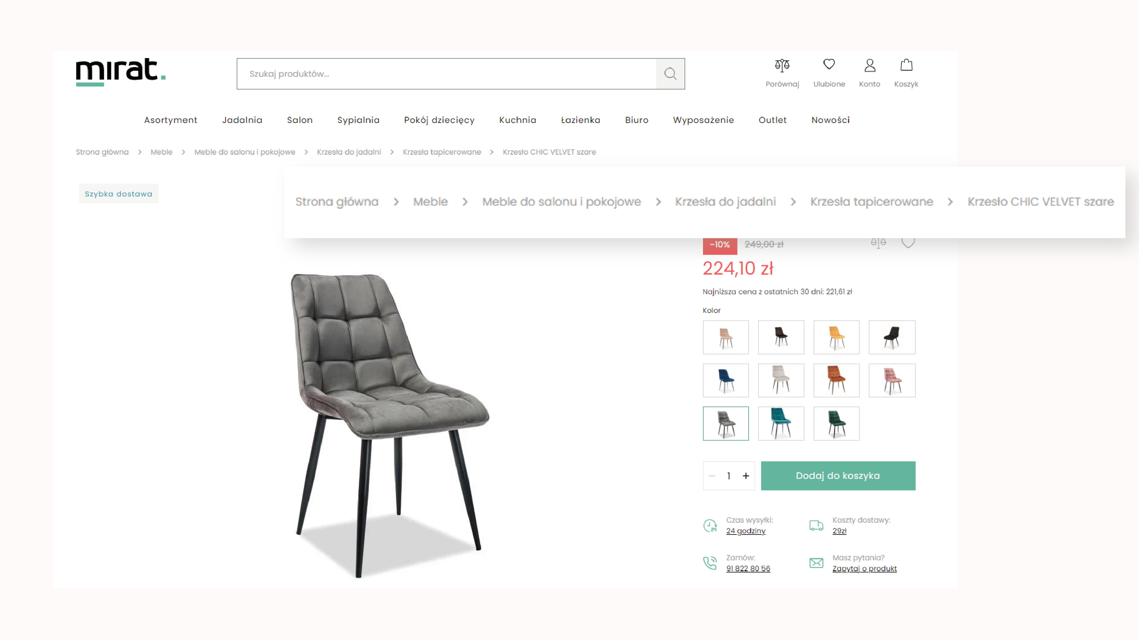
Breadcrumbs are a bar most often placed at the top of a product page that informs the user of the path they took. They are especially useful if your site has hierarchically extensive categories. This makes it easier for customers to navigate the site. They can also quickly return to an earlier category, which is sure to be received positively by customers who have not yet selected a particular product. However, these are not all the benefits - breadcrumbs not only help users, but can also have a positive impact on SEO. A product page with properly implemented "breadcrumbs" can improve the indexation of the site by search engines, resulting in higher positions in organic results.
Time control - delivery and shipping information
Customers value online shopping for the sake of time. It is important to them both to be able to place an order quickly and to have a short waiting time. For this reason, placing information on the product card regarding the expected delivery time and the availability of products in stock is crucial. Such a message helps customers plan their purchases and allows them to prepare for when they can expect their order to be delivered (which reduces the level of uncertainty and frustration).
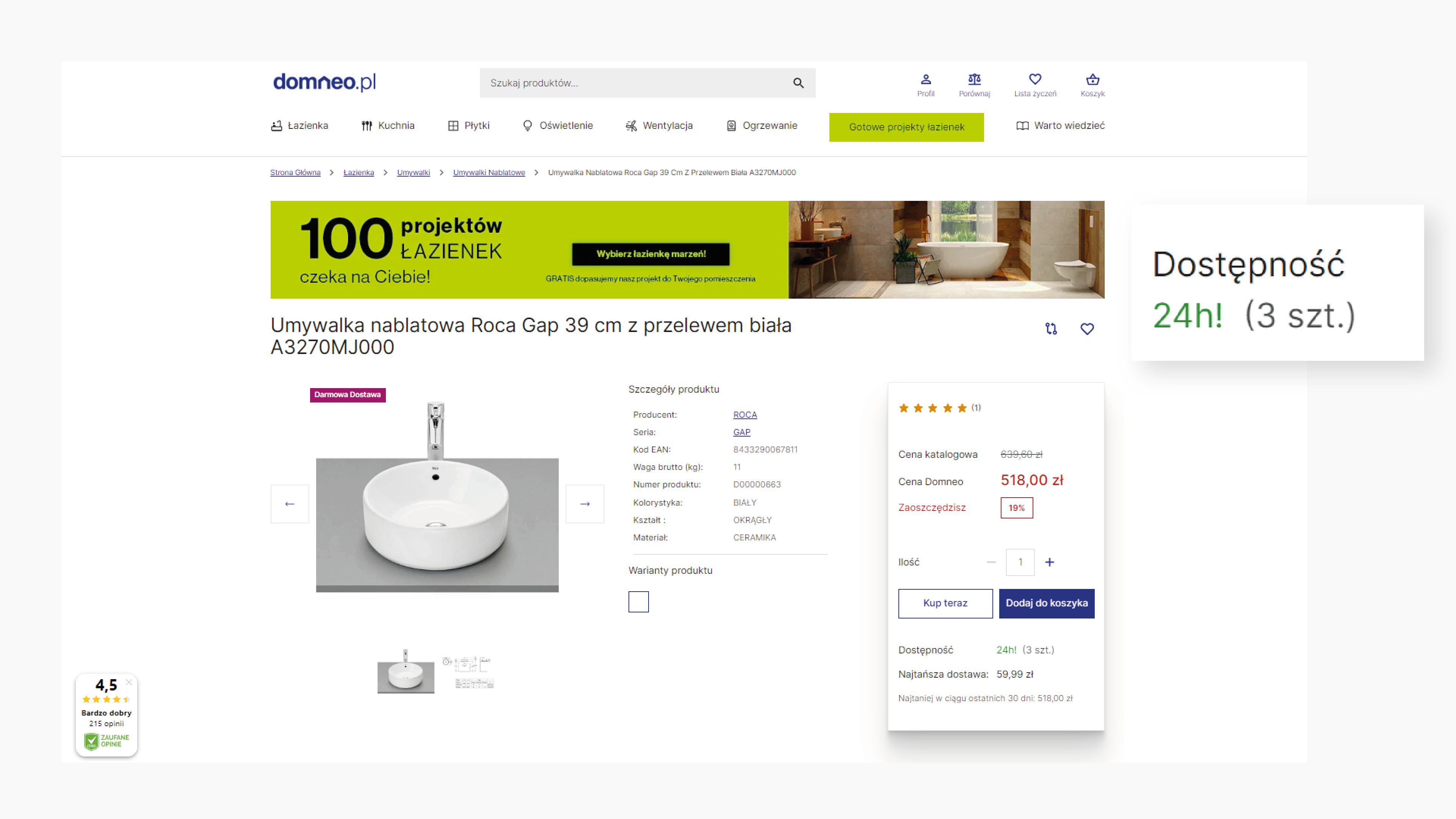
This type of information can also be used to increase conversions. To achieve such an effect, in addition to information about the planned delivery date, you should also show the customer the number of products available in stock. When users see that there are only a few products left, they feel time pressure and are more likely to make a purchase decision so as not to miss the opportunity. On the same principle, you can also alternatively display information about the number of products that other customers have recently bought. It is this element of sales psychology that can significantly increase sales in your e-store.
Description - source of product information
Although Internet users are more likely to consume visual content (according to the Forbes study "Visual Content: The Future Of Storytelling", this may be as high as 91% of users), the product description is still a valuable source of information about the product. For this reason, it is worth ensuring that description texts are consistent in structure and quality. Consistent content not only affects the professional image of the platform, but also makes it easier for customers to compare different offers, which translates into more informed purchases.
Content is not everything - how the description is written is also important. The language used should be understandable to the target customer group. The text should not contain an excess of technical terminology (if it is not necessary), and its tone should fit the nature of the product and audience. What other rules should you follow when creating product descriptions? You should make sure that:
- technical data corresponds to the complexity of the product - the product description should include technical data adapted to the type of product. For example, electronic products should include detailed specifications. To organize the information, you can add all necessary data (e.g. Instructions, technical drawings) as pdf files.
- The most important information is highlighted - key information such as price, availability or warranty should be highlighted graphically, e.g. with icons, colors or bold text, so that it can be easily noticed by customers.
- Call to Action (CTA) is clear - it's a good idea to include clear CTAs in the product description that direct the customer to perform a specific action (e.g., "add to cart" or "order now").
- Highlight the so-called USP (Unique Selling Point) - the product description should highlight the unique features of the product that make it stand out from the competition. It is these features that can convince customers to buy.
In conclusion, accurate and consistent product descriptions are critical to building customer trust and helping customers accurately understand the product being offered. Creating such descriptions is an investment that contributes to a better shopping experience and an increase in online store sales.
Contact - to clarify any doubts
A customer in a stationary store can always count on an assistant who is ready to answer his or her question. Placing a contact option on the product card allows eCommerce users to feel the same way, providing them with a sense of reassurance and comfort during the shopping process.
It is important for shoppers to be aware that they can ask a question or get help with their concerns at any time. By providing options such as a chatbot, email contact or phone number (especially important for B2B customers, who are often individually assigned a contact person), you give customers the ability to communicate and address concerns immediately.
In addition, it is also a good idea to include a Frequently Asked Questions (FAQ) tab on the site. This helps solve the most common questions quickly, without having to contact customer service. The FAQ is a kind of guide that can be especially helpful for standard inquiries about delivery, warranty, or return policies.
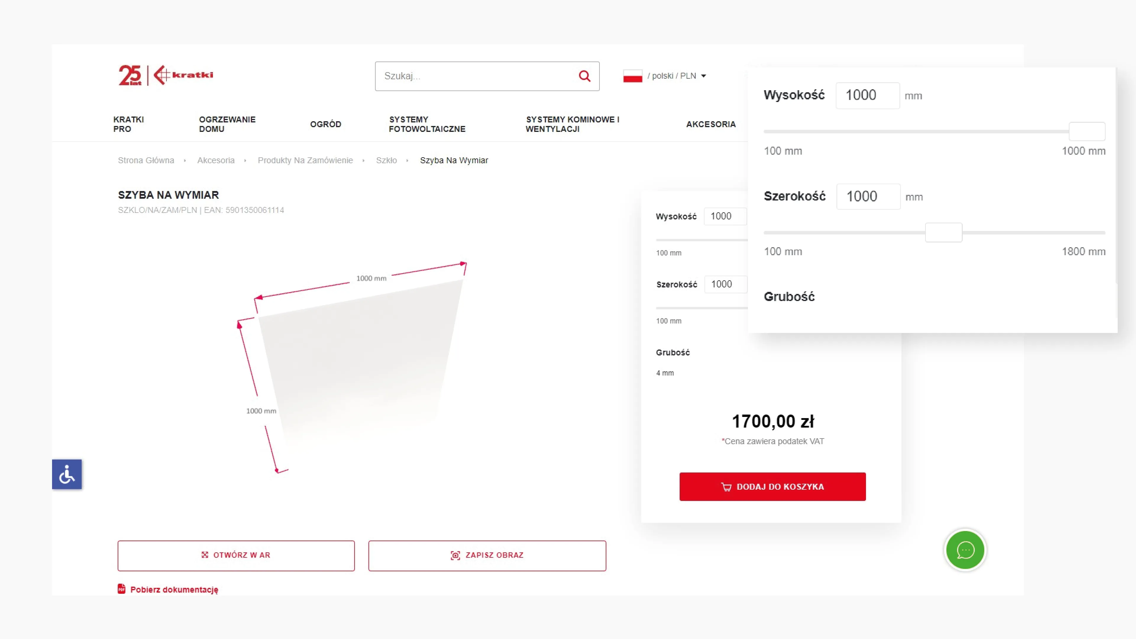
A variety of choices
Favorite color, matching size, appropriate size - these are the decisions that the customer faces when selecting the final product on the website. To make the process easier, it is a good idea to present the available options according to the principles of User Experience. Pay attention to, among other things:
- selection priority order - put the most important selection options first (e.g., color, which is often the first selection criterion for clothing).
- icons and symbols - use intuitive icons or symbols next to options, such as a color palette (instead of typing the names of individual colors) or size icons. This will give users a better idea of the range of offerings and help them find the option they are looking for faster.
- live update - after making a selection, the customer should immediately see the option they have chosen. For example, the main image of a product can change with the selection, allowing the customer to quickly compare different options.
- suggestions and hints - analyze the user's purchase history data (if possible). Based on these, you can suggest to the customer to choose a size or color that they have previously chosen or that is popular among customers with similar preferences. Personalized suggestions can make the customer's choice much easier.
Choosing the final version of a product should be, above all, intuitive. That's why it's a good idea to design the product page in such a way that it allows quick decision-making and doesn't force the customer to make unnecessary efforts.
Get inspired - how to design a distinctive product page?
Designing a product page should meet generally accepted standards. However, in order to really stand out in the crowd and gain loyal customers, it is worth going a step further. A product page should not only meet basic expectations, but also surprise you with innovative elements that will make customers remember your store for longer. When deciding on additional functionalities, you should first match them to the nature of your offer and the needs of your customers. Looking for inspiration for improving your product card? Explore our realizations.
Product presentation using VR
Implementing a platform for our fireplace client, we used technology based on Augmented Reality to allow consumers to see how the selected product would look in their own room. All the customer has to do is use their smartphone's camera to see if the fireplace matches the interior.
Product configurator
Working on the same project, we also created a solution that allows real-time visualization of fireplace glass of any size and material type. In this way, the customer can immediately see and order the product variant of his choice.
Ready-made arrangements
During the realization of an online store for Domneo - a brand from the interior design industry, we developed a solution that allows the purchase of a ready-made bathroom design in one click. The customer can look at each product in detail, thanks to an interactive visualization, and if necessary (if possible) swap individual items for others. In this way, he can make a purchasing decision quickly and easily.
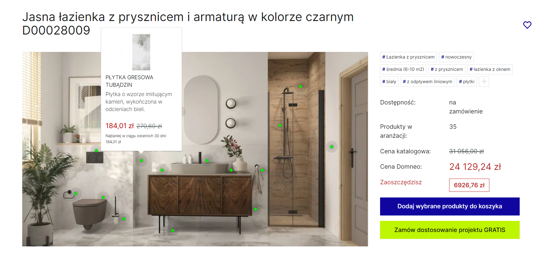
Interesting solutions on a product card not only attract customers' attention, but also make it easier for them to choose and make purchasing decisions. This can translate into increased conversions and greater customer satisfaction.
Product first - create a product card that sells
If you've managed to create content on your product page that engages the user, you've probably moved one step closer to more sales. "Probably" because the most important element of a product page is balance. It's worth remembering that while interactive elements and diverse content enrich the customer experience, an overabundance of information can make a customer feel overwhelmed or lost. Therefore, designing a product sheet requires a balance between providing valuable content and keeping the site simple and clear. In this article, you learned 5 tips for designing a product page. And if you're still looking for inspiration, you can find more articles on this topic on our blog.
Do you accept the challenge of improving your product pages?