Table of contents
- Responsiveness - what does it mean?
- How to design a responsive online store?
- What differentiates mobile-friendly approach from responsive design?
- What sets a mobile-friendly approach apart?
- Mobile-First - more than just another version of an e-shop
- Does the mobile-first approach always work? What to choose?
- Which approach will you choose for your online store?
- user preferences - understanding which devices and screen sizes are most commonly used by your target group of customers will allow you to tailor the design to their expectations and preferences.
- available solutions - you can ensure responsiveness in many ways, so it's worth exploring all available solutions. If you use a ready-made theme or template for your online store, make sure it has responsive elements. When creating a project from scratch, plan to work on responsiveness. Check if the chosen platform or framework offers built-in responsiveness features (such as Shopify or Magento), which can shorten developers' work time.
- UX design - make sure the website design provides proper layout and content distribution (e.g., for smaller devices, content may scale in the form of tiles, avoiding the need for extended scrolling). Pay attention, among others, to dynamically adjusting the size of product images to different screen sizes.
- user behaviour monitoring - regularly observing the store on different devices and browsers will help you identify any responsiveness issues (e.g., with the appearance of new screen formats) and quickly make necessary corrections. For this purpose, you can use free testing tools such as Google Mobile-Friendly Test, which automatically assesses the website's mobile-friendliness and suggests possible improvements. Additionally, it's valuable to utilise tracking tools to monitor the purchase path of individual users (e.g., HotJar or Clarity), which help identify specific stages where customers may experience responsiveness issues.
- navigation - menu and other navigation elements (e.g., "breadcrumbs") should be designed to be easily accessible, intuitive, and eliminate the need for complex movements. An example could be a hidden menu (or "hamburger menu"), which expands upon touching the icon, presenting the user with all available options.
- readability - instead of just shrinking text to fit smaller screens, the mobile-friendly approach may include, among others: larger font sizes, increased spacing between text, and the use of abbreviated content versions to facilitate reading on small screens.
- orientation - websites designed for mobile devices should display correctly in both horizontal and vertical formats, considering that their users often change the screen orientation depending on their preferences.
- loading speed - the convenience of smartphones means that users expect even faster page loading times than on computers (which are already high). To ensure fast page loading on mobile devices, techniques such as image compression or CSS and JavaScript code minimization can be used.
- clickable elements - when designing buttons on the store's website, it's necessary to place them properly and adjust their size. The lack of appropriate spacing between individual buttons can easily lead to errors. A good example of button placement would be placing it at the bottom of the screen, where it's easily accessible to users who navigate the site with one hand.
- It does not require the creation of a separate version of the site for mobile devices, which eliminates the additional costs associated with maintaining and updating them.
- Due to automatic adaptation to different screens, a responsive solution is more resistant to technological changes and the emergence of new devices in the future.
- Some responsive sites may have performance issues on mobile devices due to excessive resource loading.
- Some elements of the site may require special customization to perfectly fit different screen sizes, which may require additional work to optimise them.
- The mobile friendly approach better takes into account the specific needs of mobile device users, which can translate into an improved shopping experience.
- Designing specifically for mobile devices allows better use of specific functionalities such as touch gestures and camera access.
- The need to maintain and update a separate version of the site for mobile devices can generate additional costs and increase the complexity of site management.
- Differences between the desktop and mobile versions can lead to a lack of consistency in the user experience, which can be problematic for users using different devices.
It's hard to imagine today's reality without smartphones, which accompany the majority of society in almost every aspect of life - from work, through travel, to entertainment and online shopping. According to forecasts, by 2025, as many as 75% of internet users will exclusively use smartphones for the latter purpose, i.e., for placing orders in online stores. Therefore, adapting an online store to the needs of mobile device users is a crucial element of every successfully operating online business (both in the B2C and B2B sectors). You can do this in many ways, such as designing the website responsively or focusing even more on the needs of mobile users, fully embracing the "mobile-friendly" approach. Learn more about the secrets of creating mobile-friendly online stores to run your online business in line with the spirit of the times (or simply - in line with the needs of customers).
Responsiveness - what does it mean?
Most commonly smartphones, less frequently tablets (although as many as 73% of Apple product owners use iPads, which represents a considerable audience), but also miniature notebooks - portable devices are characterised by significant diversity in terms of features such as type, brand, operating system, or screen size. Such variety poses a challenge - how to build a website that perfectly adapts to each device and satisfies all users? At this point, responsive design comes to the rescue, whose main goal is to provide users with seamless navigation and content browsing on the website, without the need for manual scaling or zooming.
In summary - a responsive website is one that automatically adjusts to the device's screen size. This way, it displays on all screens in the same quality, whether it's a large monitor or a smartphone. This approach ensures that visitors to the e-shop receive an optimal shopping experience under all conditions.
How to design a responsive online store?
Designing a responsive online store eliminates the need to create multiple separate versions (which could prove to be a tedious and costly task given the number of devices on the market). To ensure optimal user experience on all devices, pay attention to issues such as:

What differentiates mobile-friendly approach from responsive design?
While responsive websites strive to adapt well to different screens, the mobile-friendly approach primarily focuses on mobile devices. This means that each functionality is designed with mobile device users in mind first and then adapted to larger screens.
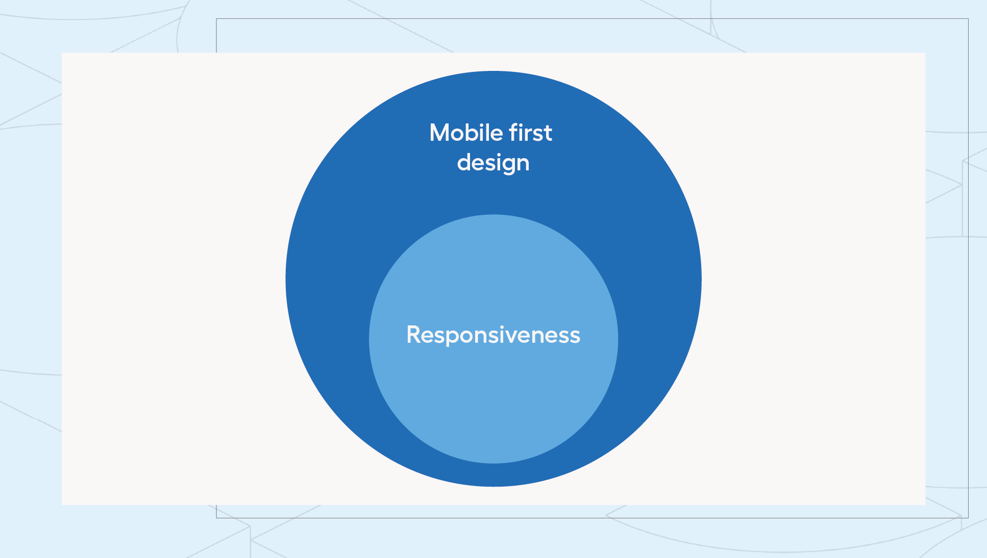
Mobile first goes a step further than responsiveness because it mainly focuses on the needs of a specific group of mobile users, rather than just on general compatibility with various devices. Therefore, it can be said that responsiveness is only a part of the mobile-friendly approach, which fully considers the needs of mobile users.
What sets a mobile-friendly approach apart?
It's currently difficult to imagine a smartphone (or other mobile device) equipped with a different control method than a touch screen. This is the first aspect considered by the mobile-friendly approach, taking into account a completely different style of navigating through the site than using a mouse (or touchpad). Mobile users almost intuitively utilise gestures such as scrolling or swiping to interact with websites. Therefore, to provide them with an optimal experience, it's necessary to design interactions in line with their habits, which they are familiar with from social media or browsing native phone applications.
Additionally, in the mobile-friendly approach, elements such as:
Mobile-First - more than just another version of an e-shop
By creating a fully mobile version of an online store, you open the door to unique shopping experiences for customers, which far surpass those known from traditional eCommerce versions designed for desktop computers. For example, you can use a smartphone camera to create virtual fitting rooms or visualise products in augmented reality (AR or VR). This way, customers can more easily see how a particular product will look on them or in their surroundings before making a purchase decision.
Additionally, it's worth leveraging the location feature, which allows for more precise creation of personalised offers and promotions tailored to the customer's current location. Furthermore, you can communicate with buyers in real-time through push notifications. However, it's essential to balance the frequency of sent messages to avoid overwhelming the user while maintaining their trust (e.g., informing them about special discounts or the current status of their order).
Wondering how to achieve such effects from a technical standpoint? One of the popular solutions in this area is the use of PWA technology, which allows for creating websites that resemble traditional mobile applications, without the need to download them from stores. Globally recognized eCommerce brands such as OLX, BMW, Trivago, as well as applications like Spotify and Uber, utilise this solution.
Does the mobile-first approach always work? What to choose?
The decision between only a responsive approach and mobile-friendly depends on the specific needs and goals of the online store, as well as available resources and priorities. In the case of starting an online business with a limited budget, responsive design seems to be the most optimal and cost-effective solution because it doesn't require creating a separate version of the website dedicated to mobile devices. However, it's essential to remember that considering the prevalence of smartphones in the online shopping process, creating a mobile-friendly version will sooner or later become inevitable. To facilitate your final decision, we've prepared tables for you, comparing the key features of both approaches.
Responsive design
Mobile Friendly
Which approach will you choose for your online store?
A fully responsive online store or a mobile-friendly sales platform are not the only ways to ensure optimal shopping experiences. There are also other approaches such as creating mobile applications, which, however, is the most demanding in terms of time and costs. For some companies, however, this may be an essential additional sales channel. However, the choice of the best approach depends primarily on individual business characteristics and customer preferences. If you're wondering which solution is best for your e-shop, our specialists will gladly help you make the best decision!