One step to increase sales - why you should implement one step checkout in your eCommerce
Finalizing an order in an online store should be quick and hassle-free. Otherwise, the buyer may abandon the thought of placing it at the last stage of the purchase path. As it turns out, such situations are not at all rare - the average shopping cart abandonment rate for all industries can reach up to 70% (according to a Baymard Institute study). This figure, in turn, translates into more than $18 billion in lost profit for online stores. How can you minimize these losses in your eCommece? A carefully designed checkout that takes into account customer preferences and pre- and post-change performance can help. Both the multi-step shopping cart and the one-step checkout, gathering the most important information when finalizing an order on a single card, have their supporters. In today's article, we will focus on the latter type, as its popularity continues to grow. You can finalize your purchases this way at Apple, Adidas or Amazon's online store. Are you curious when it is worth opting for one step checkout? What is worth paying attention to when implementing it? And finally, how does it affect the level of sales? We invite you to read on!
One step vs. many steps - which solution to choose
Regardless of the type of product, the consumer's path to finalizing an order is generally similar. By default, it takes into account first of all:
- adding the product to the shopping cart and confirming the selection,
- indicating the method of delivery and payment,
- completing customer data,
- making payment in the preferred form.
However, these are not all the steps a buyer may encounter. Nowadays, e-shops are outdoing themselves in offering additional options (so-called added value) that can be appreciated by the buyer. These include, for example, complementary services (such as shipping insurance), choosing a specific delivery date or personalizing the order (such as gift wrapping or decorative engraving on the product). Each additional step, however, requires time and effort to make additional decisions. Such an elaborate checkout can discourage those customers who care about finalizing their order quickly, or make them rethink their purchase decision. So how do you speed up the process while keeping e-consumers comfortable?
As a solution to the problem of a heavily elaborated order finalization path and potential shopping cart abandonment, one step checkout may prove to be the solution. The essence of this approach to shopping path design is to encapsulate the entire shopping process inside a single page. All the steps necessary to place an order are in one place, and the user doesn't have to switch to additional tabs to enter address information, choose a delivery type or make payment. Because the information is placed on a single page (and the number of necessary clicks is reduced), one step checkout allows for faster finalization of the purchase and makes it more intuitive.
Abandoned shopping carts vs onestep checkout - how to design an e-commerce shopping path?
Nearly 20% of shoppers abandon online purchases due to an overly complicated checkout - these are the findings of a 2022 study by the Baymard Institute. The same publication also found that it is possible for most eCommerce stores to reduce the default number of purchase form elements from 20 to as much as 60%. Simplifying the process is a win-win for both eCommerce managers and their customers. E-commerce store owners can thus increase conversions on the site, as a simpler shopping process is more likely to result in the finalization of an order. Consumers, on the other hand, get a better shopping experience and save their time. Achieving this effect is possible with one step checkout, among other things. What other advantages does implementing this functionality in your eCommerce bring? Above all, potential customers appreciate:
- Transparency - gathering all the stages of an order in one place guarantees clarity of the purchase path. The customer does not have to go through multiple pages, which makes it easier to navigate the entire process.
- Fast order finalization - shortening the path allows the customer to instantly enter the necessary information and make payment. As a result, the order can be finalized in just a few moments.
- Minimize errors - using this solution means that the customer doesn't have to go back to previous steps to make changes or check if all the data match. He can verify them on a single view before placing an order, which reduces the risk of errors.
- Reduce the risk of cart abandonment - the simpler and faster the ordering process, the greater the chance of completing the purchase. Sometimes this doesn't even have to mean abandoning individual form items. Presenting them on one page instead of multiple tabs will visually give the impression of less required involvement, which will not discourage the orderer.
- Saving the customer's time - often when going through the steps of placing an order, it turns out that among the available delivery or payment options, the methods preferred by the customer are missing. In such a situation, he or she feels distracted and abandons further purchases immediately. In the case of one step checkout, the buyer has the opportunity to scan the entire process with his eyes and decide to place the order on that basis.
| E-commerce owner | Customer |
|---|---|
Checkout & your eCommerce - tips to design the perfect solution
When betting on one step checkout, you have to expect that, like any solution, it also has some drawbacks. When designing the view, the biggest challenge may be the clear and UX-compliant placement of all elements on the page. How to avoid this and other mistakes when creating this page? Learn our tips!
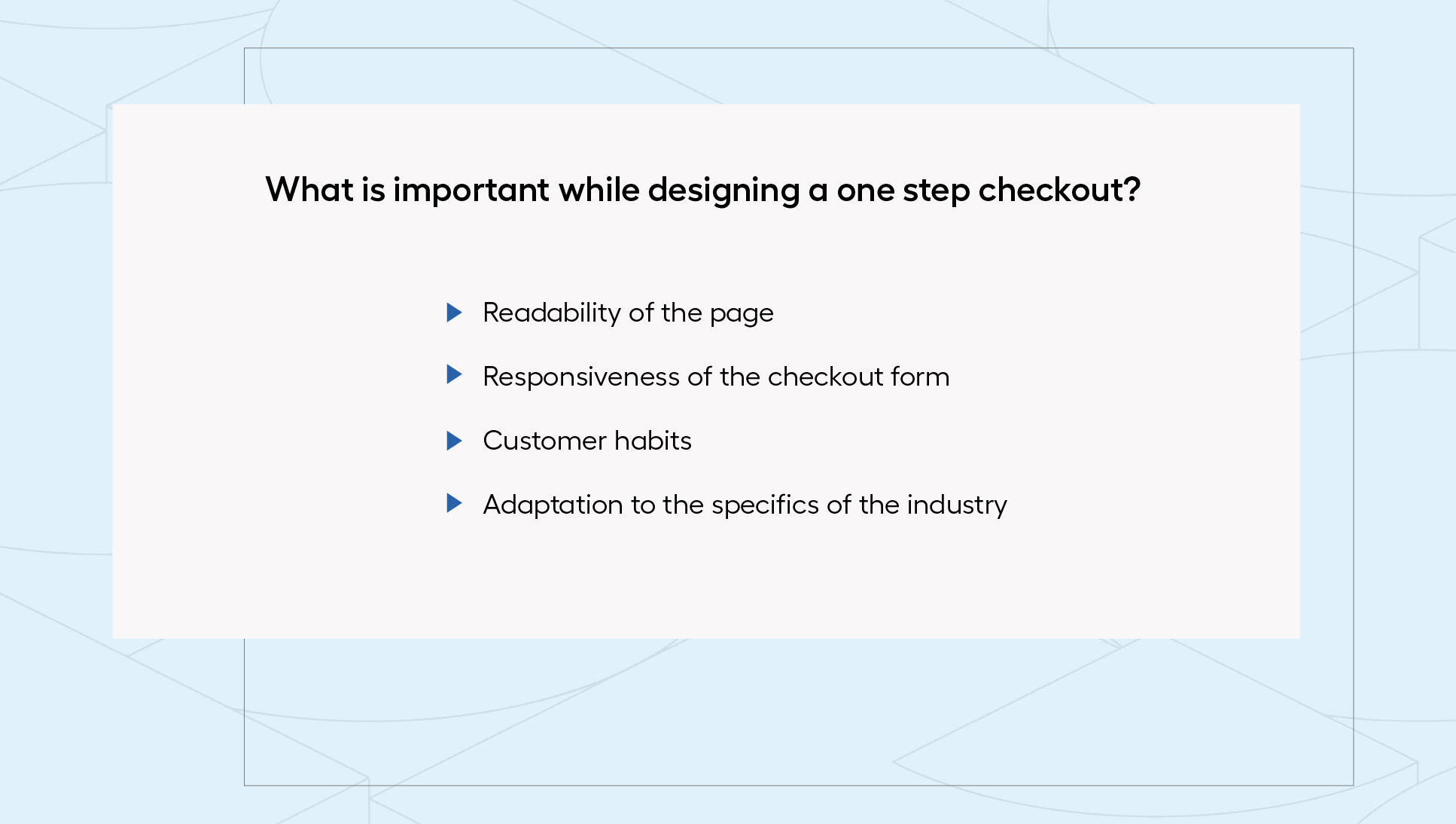
Take care of readability
Pamiętaj, że klient nie może czuć się przytłoczony ilością informacji dostarczanych za jednym razem. W pierwszej kolejności zadbaj o czytelność - skoncentruj się na podstawowych danych, które są niezbędne do finalizacji zamówienia (m.in. dane kontaktowe, preferowane metody płatności czy dostawy). Co, jeśli musisz jednak uwzględnić dodatkowe pola w formularzu (np. wybór rozszerzonej gwarancji czy personalizacja zamówienia)? W takiej sytuacji warto ocenić i przetestować jakie rozwiązanie okaże się najskuteczniejsze. Czasami dodanie dodatkowej strony może okazać się koniecznie w celu uporządkowania etapów. Aby nie wzbudzić w kliencie poczucia przytłoczenia, warto rozważyć dodanie paska postępu na stronie, co pozwoli pokazać jego progres w składaniu zamówienia.
Create a responsive checkout
Also note that in the era of omnichannel sales, your store's checkout should display correctly on different types of devices and screens. Make sure that especially on smaller displays there are no problems, and monitor its performance on a regular basis. Whether a customer is using a cell phone or a tablet, they need to be able to access the shopping process conveniently and seamlessly to maintain a positive shopping experience.
Be aware of customer habits
Although one step checkout has many advantages, some customers are still used to a multi-step solution. So when implementing one step checkout, make sure that the purchase process remains natural. The customer should navigate the form intuitively and without feeling lost.
Introduce changes gradually and monitor customer reactions. Gather feedback and comments to better understand how one step checkout affects customers' shopping experience. Make any adjustments based on this. You can use A/B testing in this process by making one step checkout available to only a portion of your audience. Comparing the results and will allow you to assess which choice is best for your business.
Make sure the solution fits the industry you operate in
One step checkout can work especially well in industries where there is a need to finalize transactions quickly and conveniently. If your store's customers are time-sensitive, looking for specific products or making multiple orders in small intervals, a one-step shopping process may prove to be the best solution. This type of purchase form can often be found, for example, in fashion or daily goods e-shops.
There are also industries where one step checkout may not be the best choice. If you rely on high customizability or product personalization (which requires filling in additional information), a multi-step approach may be better. In addition, for luxury products, customers will expect space to think about their decision. In that case, extending the checkout can also enhance the unique shopping experience of luxury goods.
Find space for additional functionality
The final checkout stage is the ideal time to offer the customer additional products or services - for example, using up selling and cross selling strategies. However, you know that while taking care of the transparency of the one-step checkout, it is worth limiting additional functionality on the card. Does this mean that at the same time you should give up the opportunity for additional sales?
Not really! It is worthwhile to provide for the placement of such functionality at earlier stages of the purchase path. For this purpose, for example, adding a pop up with suggested related products right after adding the selected item to the shopping cart will work great. A good alternative would also be to add this type of section on the product card. In this way, you can effectively encourage the customer to make additional purchases without disturbing the transparency of the order finalization process.
Will one step checkout bring your eCommerce closer to success?
The moment a buyer proceeds to finalize an order is not the same as making a final purchase decision. There is still a final stage before it - the checkout. Proper design of this space on the site can be crucial to achieving the sales goals. It's important not to create unnecessary challenges for the buyer and to tailor all functionality to his needs. The choice between one step checkout and a multi-step version of the shopping process should therefore be based on the specifics of a particular eCommerce store. What do you think, is your eCommerce and one step checkout an ideal combination?