Table of Contents:
- Online Store Audit - What Does It Actually Involve?
- What Does an eCommerce Audit Examine?
- Which Audit Methodology to Choose?
- Audit in 10 Steps, or Nielsen's Heuristics
- What Should an SEO Audit of an Online Store Include?
- What Does a UX Audit Bring to eCommerce? And What is SXO?
- eCommerce Audit Completed - What Next?
Are you looking for new development paths for your online store? Are you wondering how to improve your current sales results? Have you noticed a sudden drop in the number of customers and want to know its source? Regardless of your motivation, an eCommerce audit may be a good solution, which is a comprehensive analysis of the platform conducted by specialists. A subjective view of your business, supported by experience, can shed entirely new light on the possibilities of your e-store. Find out how an online store audit is practically conducted and how it can contribute to improving your platform.
Online Store Audit - What Does It Actually Involve?
In business terms, an audit involves a comprehensive examination of a company by an external and independent entity. This allows for the identification of the company's strengths and weaknesses, as well as comparing its operational goals with reality. But how can the concept of an audit be related to eCommerce?
Similar to a business audit, the key goal of an eCommerce audit is to identify errors, shortcomings, and find opportunities for optimizing the operation of the e-store. The knowledge and experience of external specialists used in this process allows for an objective view of the functioning of your sales platform. As a result, the audit provides valuable insights that can significantly impact the success and efficiency of your online store.
What Does an eCommerce Audit Examine?
Tailoring the scope of the audit to your online store is crucial for an effective review and assessment of your online business's performance. Depending on the complexity of the site (the number of subpages, products, functionalities), the audit can cover various areas of the e-store. How to choose those that will best assess the condition of the sales platform? Depending on the chosen scope of the audit, it most often includes:
- technical and functional elements, e.g., page loading speed, responsiveness, or store performance measured based on metrics,
- the quality of the content posted on the site and its compliance with SEO principles,
- ensuring appropriate UX, particularly focusing on consistency, design, and aesthetics of the site.
Before you start the audit and choose specific areas of research, define your goals and expectations. Do you want to identify weaknesses in your eCommerce, optimize sales processes, or perhaps improve conversion rates? Clearly defined goals will help you select the appropriate areas for investigation. Also, analyze the unique requirements and specifics of your industry, the profile of your target audience, and analytical data. If in doubt, it is worth seeking help from an experienced software house that can assist in identifying areas for improvement and propose specific solutions. Moreover, such collaboration can, over time, provide ready-made tools and solutions that will help you fix identified errors and develop your eCommerce.
Which Audit Methodology to Choose?
The result of the audit work should be a list of areas of the e-store that are worth improving and recommendations for possible changes. Various research methods are used to gather all the necessary information. The two most commonly used methods are heuristic evaluation and cognitive walkthrough. You will learn about the first one by reading this article. If you are curious about the essence of the cognitive walkthrough, follow our blog - we will surely reveal its details soon!
Audit in 10 Steps, or Nielsen's Heuristics
Although the word heuristic may seem like a complicated term, each of us, in a more or less conscious way, uses heuristics in our daily lives. This concept encompasses the ability to seek relationships between facts, discover new truths, and formulate hypotheses. It often happens that such reasoning can lead to the creation of certain mental simplifications and predictable behavior patterns.
Based on this principle, in 1990, Jakob Nielsen, a Danish usability expert, developed 10 heuristics that have now become the foundation for conducting eCommerce audits. Each of the principles relates to specific areas of the website and their evaluation based on accepted rules. Check to see if you are indeed utilizing each of the heuristics in your online store.
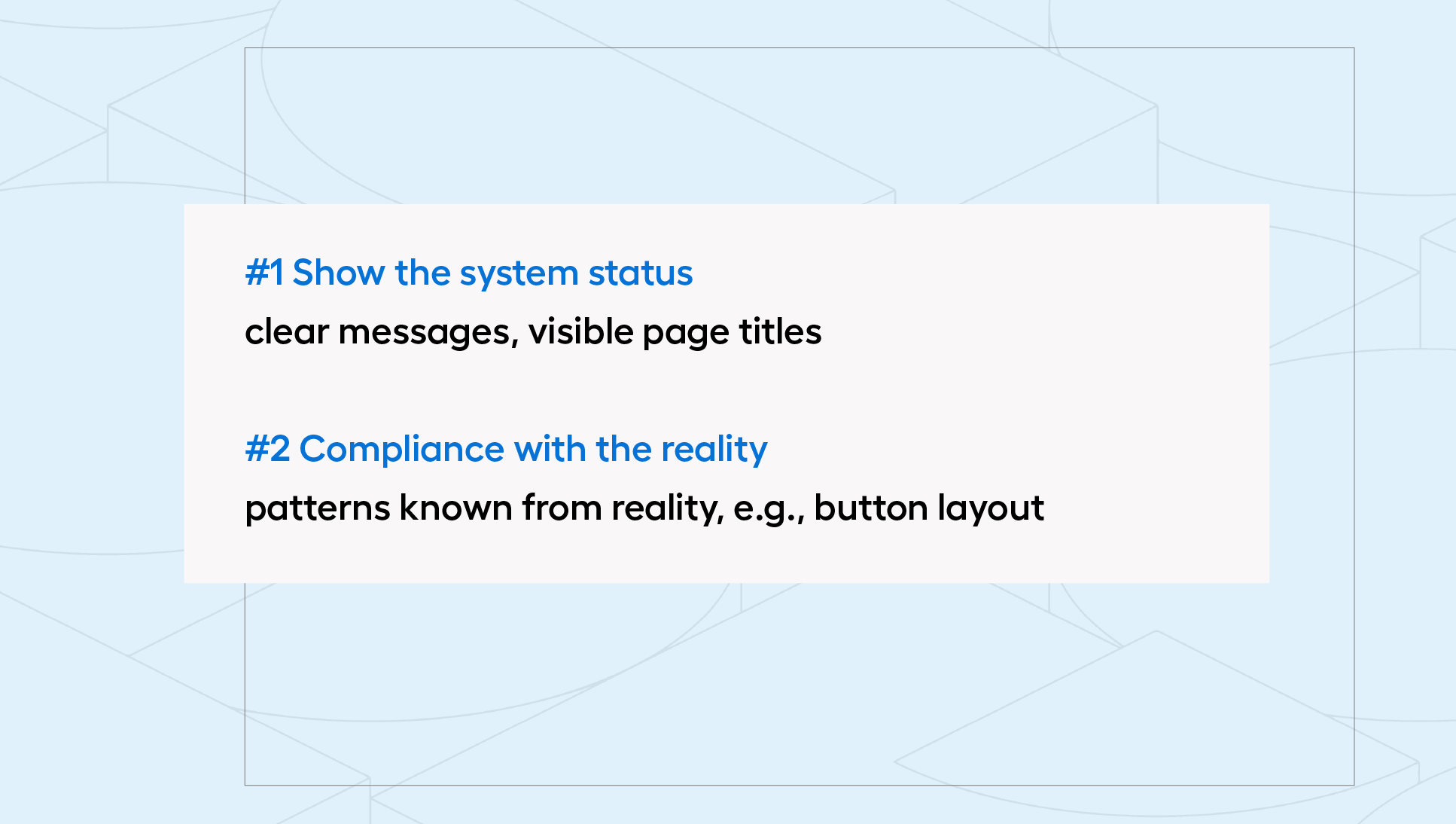
#1 Show System Status
First and foremost, ensure that your platform allows users to perform all the actions they expect. A potential customer visiting an e-store will expect an intuitive and straightforward shopping path, where no element of the process raises doubts. To achieve this goal, remember to provide information about progress at various stages of their journey, for example, through visible page titles, as well as by including a clear message about the actions they can take, such as adding a product to the cart or the payment status.
#2 Ensure Consistency Between the System and Reality
Have you ever wondered why so many people use music services like Spotify? Notice that the design of such applications reflects physical music players (including the layout and shape of buttons). Users are more inclined to use functionalities they are familiar with from reality. This principle also applies to eCommerce - buyers are more likely to make purchases in a store where navigating the entire shopping path feels familiar and natural. You can achieve this effect by ensuring the use of clear and intuitive design or customer-friendly language (e.g., using CTAs with clear messages).
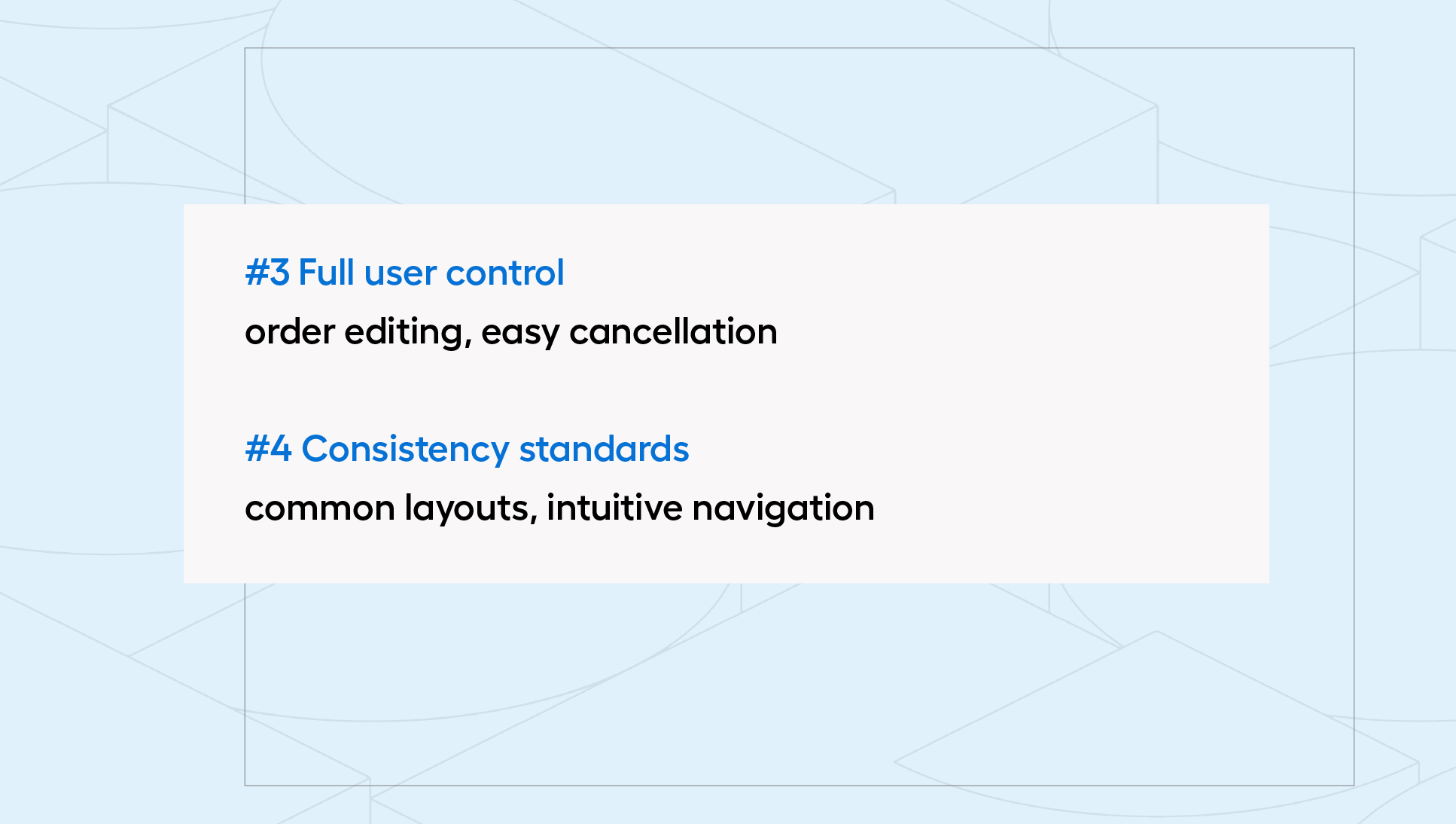
#3 Give Users Full Control
A lack of familiarity with a new system can create a fear in users that they might accidentally make an irreversible mistake. Such thoughts can completely discourage visitors from taking any actions on the site. For this reason, it is important to provide them with a sense of full control over their actions. Ensure that the ability to edit an order or cancel a purchase is as intuitive as adding a product to the cart.
#4 Stick to Standards and Maintain Consistency
It is worth remembering that when designing the layout of your platform, you should consider the habits and expectations of buyers. The product search bar is most often placed at the top of the page, dropdown menus are located on the left side or at the top, and options (e.g., color or size) appear next to the product price - this understanding of a website has become a standard. When a website aligns with this standard, buyers do not feel confusion or disorientation. It is particularly important that new customers can almost immediately find their way around the site, locate the products they are interested in, and use the functions they need.
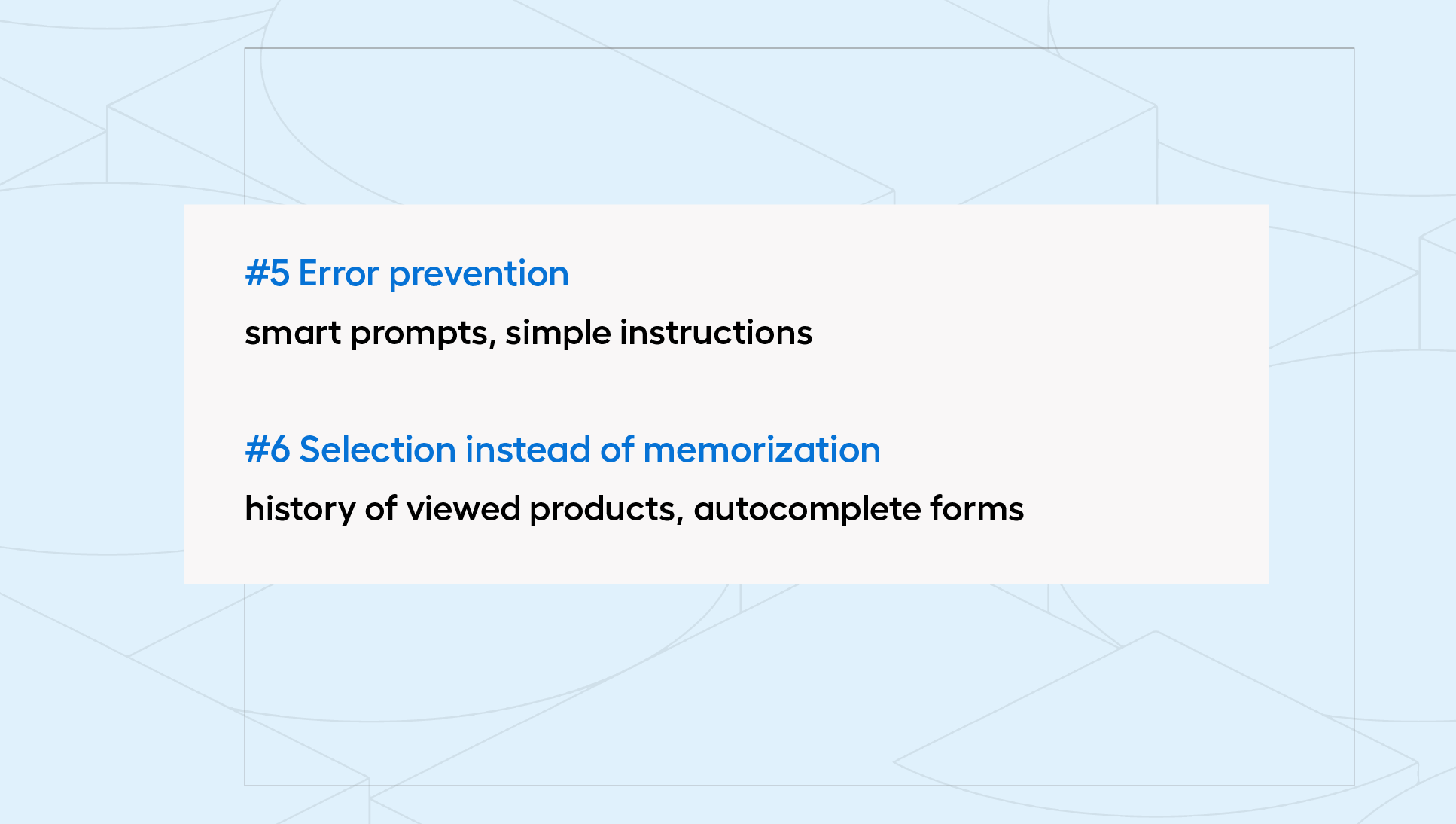
#5 Prevent Errors
When engaging in new activities, it is easy to make mistakes. Therefore, it is no surprise that a customer visiting an unfamiliar platform for the first time may feel lost. Nielsen distinguished two types of such errors - slips and mistakes. What is the difference between them, and how can they be prevented?
Slips are unconscious errors made by customers, often due to their inattention. Due to the individual characteristics of buyers, it is impossible to completely avoid them. However, you can reduce their occurrence, for example, by implementing smart suggestions in the product search. With this functionality, a customer will find the searched phrase even if they make a "typo" while typing it. On the other hand, mistakes are conscious errors that arise directly from poor website design. For example, including information about a product's unavailability in stock will cause a frustrated customer to abandon any order.
#6 Give Choice Instead of Forcing Memorization
Have you ever forgotten an important task, even though you really wanted to complete it? This happens because humans have limited short-term memory resources. When designing the interface of your eCommerce, you should reduce the number of elements that the user has to remember. When creating individual functionalities, follow the principle of "suggest, indicate, remind." A good practice would be to include a "recently viewed" section in a visible place on the page, provide auto-completion for forms, or offer the option to reorder. The latter will be particularly well-received in industries where customers make regular transactions (e.g., everyday items).
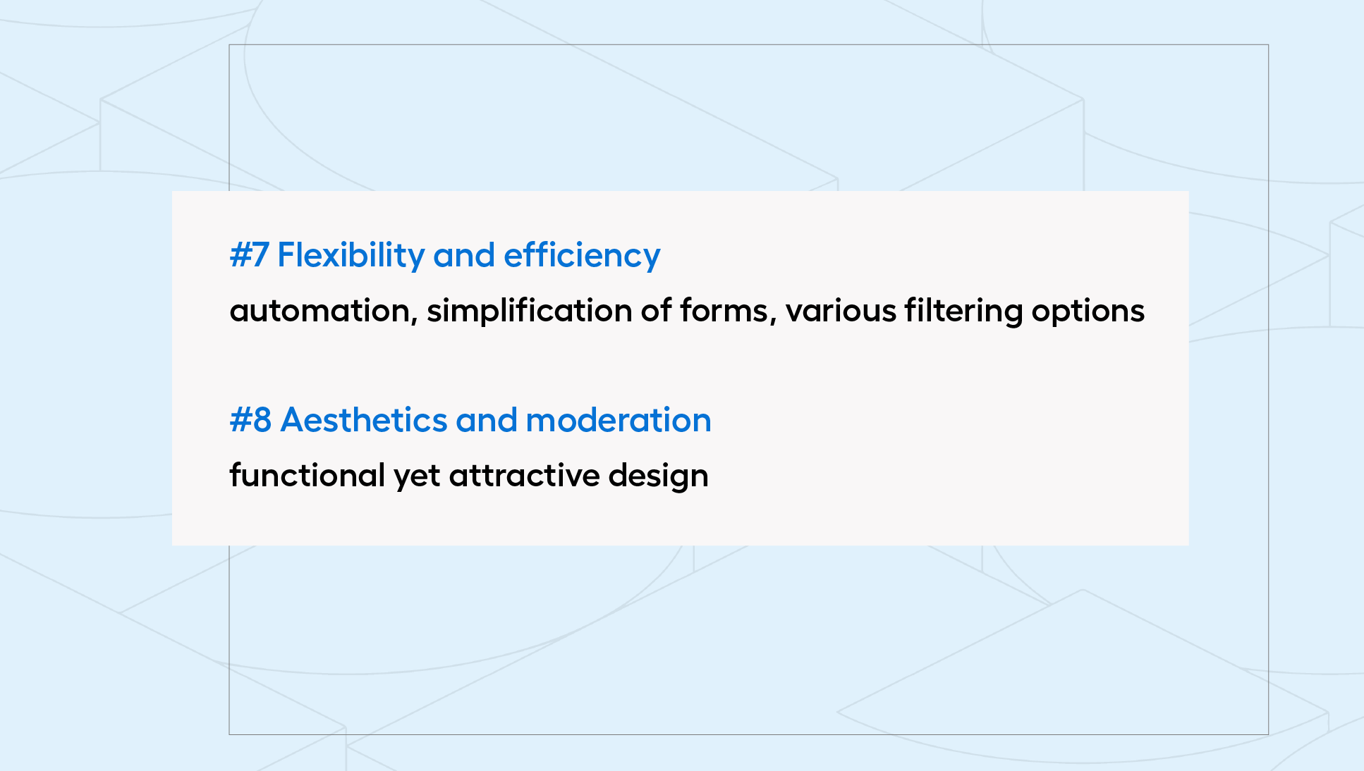
#7 Ensure Flexibility and Efficiency
The system should adapt to the different needs of customers, so when designing the platform, you must meet the expectations of both more and less experienced users. You can achieve flexibility and efficiency in the e-store by employing various methods, such as:
- automation of individual stages, e.g., by allowing registration and login via social media,
- simplification of forms (selecting all consents with one click),
- facilitating product searches by allowing the selection of multiple filters simultaneously.
#8 Focus on Aesthetics and Moderation
An online store should not only be visually appealing and consistent with the brand's visual identity but, above all, fulfill its primary goal of maximizing sales. For this reason, it is important to ensure that the layout is functional and promotes smooth navigation on the site. However, this does not mean that your eCommerce should be completely "flat" and devoid of visual effects. It is important to achieve a compromise that ensures the design does not distract the customer when making important decisions (e.g., during the order finalization process).
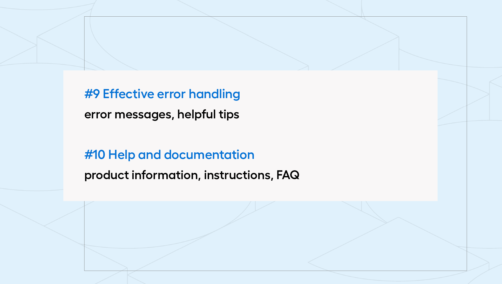
#9 Ensure Effective Error Handling
At this point, it is worth returning to the 5th heuristic. What if, despite your efforts, errors occur on the site? In such a case, you should not hesitate but immediately provide the user with a clear message upon detecting a mistake and, if possible, suggest a solution. For example, if a user proposes a password that does not meet the requirements during registration, it is advisable to immediately display information about the login rules (such as the number of uppercase letters or special characters in the password). This way, the customer will not feel frustrated by having to make repeated attempts to enter the password.
#10 Provide Help and Documentation
Depending on the type of products and the industry you operate in, it may be necessary to implement somewhat more advanced solutions. If you sell technological products, it is important to provide detailed information regarding their specifications. You can do this by including downloadable attachments in a visible place on the product page. Conversely, if the products in your offer require personalization, a good idea is to prepare a short step-by-step guide (e.g., in video format).
Don't forget that there is always a possibility that some users will simply need assistance. Regardless of the complexity of the site, it is worth providing basic information, such as in the form of a FAQ section (frequently asked questions).
What Should an SEO Audit of an Online Store Include?
Although it may seem that an SEO audit of an online store primarily involves keywords, in reality, it is a comprehensive analysis of your website. Do the published contents answer real questions and needs of users? Are they properly optimized — do they contain appropriate headings, bullet points, and do images have alt descriptions? Are you using other formats, such as videos or infographics? The regularity of publication and the content calendar of your competitors also matter.
Technical aspects are also analyzed, including content duplication, URL structure, and site loading speed. All of this is to facilitate Google algorithms in navigating your website. The technical SEO audit of the site also includes mobile device optimization. “Mobile first or last?” asks Justyna Pliś in the report “E-commerce in Poland 2024” and adds that “although mobile-first principles have been present in theory for years, practice shows that many online stores still do not meet the expectations of mobile users, thus lowering their chances of conversion.” For the past several years, three-quarters of surveyed users have been using their smartphones for online shopping.
Additionally, Google has been putting a lot of effort into ensuring that algorithms effectively detect link manipulation. Both links leading to our website (internal linking) and those that lead away from it (external linking) are significant. Therefore, an SEO audit also involves verifying whether they build trust and authority or, conversely, harm your domain.
What Does a UX Audit Bring to eCommerce? And What is SXO?
Increasingly, there is talk not only about SEO but also about SXO (Search Experience Optimization), which combines optimization activities and UX audit of an online store. It focuses not only on improving rankings in search results but, above all, on increasing user satisfaction and engagement while using the website.
How does a UX audit enrich SEO? Primarily, it complements it with the user's perspective, asking questions about motivations, needs, navigation on the site, and potential errors or obstacles. It takes into account, among other things:
- the context of using the site (e.g., time of day or type of device),
- readability of content, e.g., appropriate contrast, font sizes, colors, spacing between elements,
- user interface (UI),
- ease of navigation on the site, e.g., the shopping path,
- user interaction with page elements, such as forms or buttons,
- visibility and accessibility of key functions (including cart, product filtering, or CTAs),
- site speed and compliance with Core Web Vitals guidelines,
- interface functionality testing in different browsers and resolutions.
In addition to the heuristic evaluation described in this article, a UX audit can also include expert analysis, user testing, surveys, and detailed behavior analysis (e.g., heatmaps of clicks and scrolling). In other words, it allows you to view the website through the eyes of the user. Sometimes, it is the small details — a button that is too small or a lack of clear information about shipping costs — that cause visitors to abandon further actions and decide to leave the site. The simpler and more enjoyable the shopping process, the greater the chance of conversion.
In summary, why should you focus on SXO? By 2025, Google algorithms, utilizing artificial intelligence and machine learning, will understand user intentions and context much better than ever before. Websites that provide real value to users will be rewarded. This requires greater attention to Google's quality guidelines (Quality Rater Guidelines), which emphasize the importance of authority, author experience, and content credibility (see E-E-A-T). Pages that meet these standards have a higher chance of ranking better in search results.
eCommerce Audit Completed - What Next?
A comprehensive analysis of the platform conducted by specialists allows for the identification of the company's strengths and weaknesses, optimization of sales processes, and improvement of store efficiency. Before starting the audit, it is important to clearly define goals and expectations, analyze the specifics of the industry, and understand the methodology of conducting the audit. You already know what Nielsen's 10 heuristics are; now it's time to put them into practice and discover new perspectives for the development of your eCommerce. If you have any doubts about how to get started - we are happy to help!