Have you ever visited a website and saw dozens of pop-ups instead of the expected content? What's worse, you couldn't close them because the button to disable them was invisible? Most likely, you quickly gave up browsing such a site. While it might seem that pop-ups merely discourage people from staying on a website, such thinking can sometimes be wrong. After all, pop-ups can serve a number of functions - from presenting necessary information, to increasing leads, to initiating additional interaction with the viewer. If you want to learn how to effectively implement pop-up strategies into your eCommerce, read the article below!
What exactly is a pop-up?
It is used to say that the role of pop-ups is limited only to annoying the viewer, which has to do with the infamous past of pop-ups. Until recently, they functioned in the consciousness of Internet users as unattractive and intrusive ads, in which clicking risks infecting the computer. Now, thanks to the possibility of their modification and enrichment with additional features, they are gaining popularity again. But let's start from the beginning - what exactly is a pop-up?
A pop-up is nothing more than a window that appears at any time on a website and contains a specific message (e.g. a request for approval of terms and conditions, information about an exclusive discount, an incentive to contact or sign up for a newsletter). They are created using various programming languages, the most popular of which is JavaScript. There are also tools that offer ready-made templates, such as:
- Layered Pop-ups,
- OptKit,
- PushPushGo,
- GetResponse.
Pop-up guide - how not to get lost in the maze of windows?
Pop-ups are experiencing their second youth, and as their popularity grows, so does the number of their types. Welcome pop-up, time-based pop-up, exit intent pop-up - what are the differences and what functions do they have? Learn about the most popular variants of pop-ups, and then consider which ones will bring the best results to your eCommerce!
Welcome pop-up
Imagine that right after you cross the store threshold, the saleswoman presents you with the entire range of brands and floods you with information about the latest promotions. In such a situation you would probably feel overwhelmed, right? The above scenario can also come true in the realities of eCommerce - especially when a content-filled pop-up appears on the page the first moment it loads. So how not to discourage potential customers? Studies show that most users ignore the first messages, so putting engaging content in them is pointless. Most often, the role of welcome pop-ups is limited to conveying necessary messages such as information about RODO, cookies or age confirmation, which is a safe compromise between the user's needs and the website owner's responsibilities.
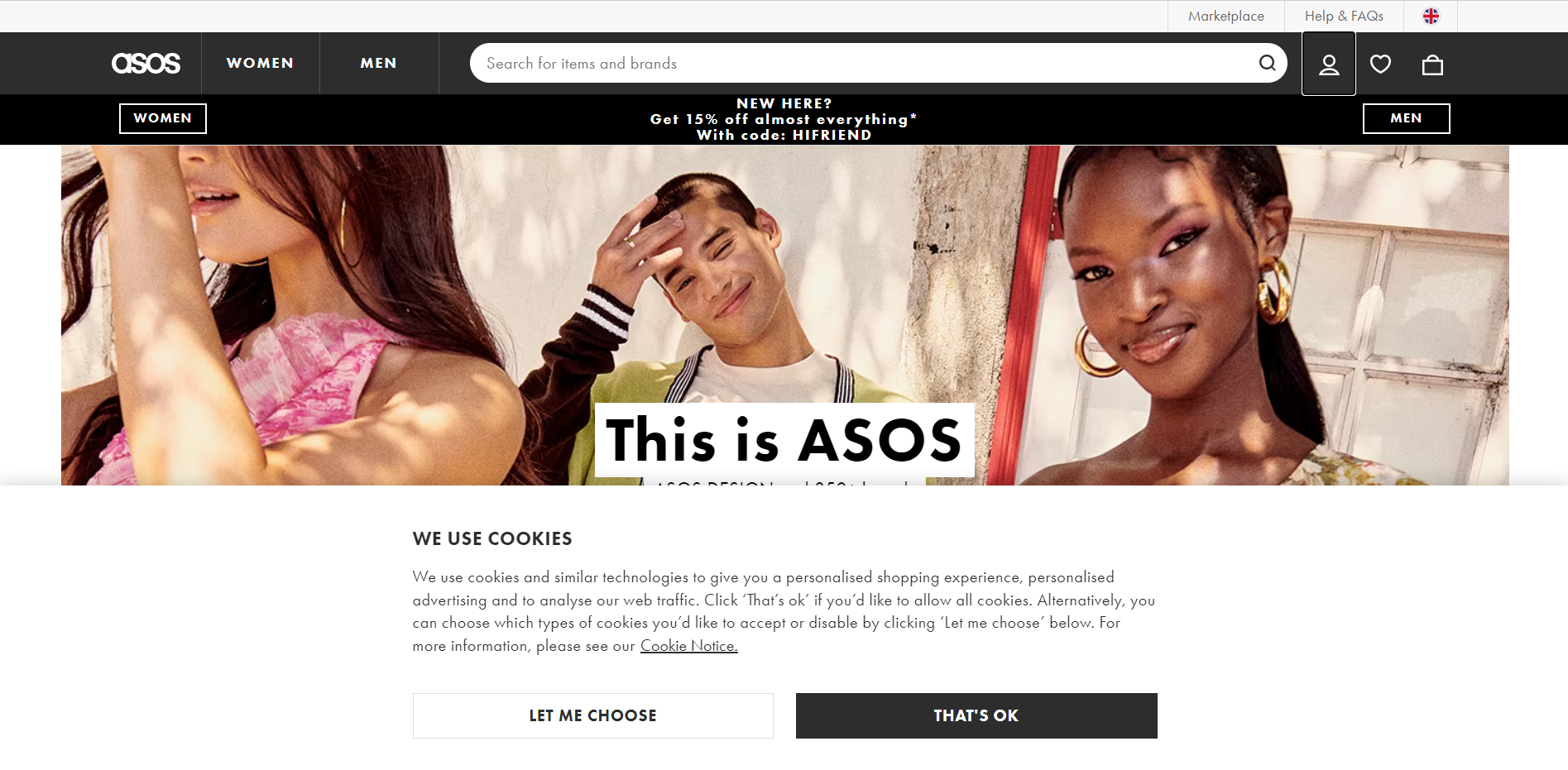 Source: asos.com
Time-based pop-up
Good timing is essential in building an effective pop-up campaign - and it's provided by a time-based pop-up, which usually appears between 10 and 60 seconds after a website is launched. How do you choose the best moment for the pop-up to appear, when the success of the entire strategy may depend on it? A useful tool will be Google Analytics, which allows you to check the average time when the site records the most traffic - for best results, it's worth setting the pop-up 10-20 seconds before and, of course, monitoring the statistics.
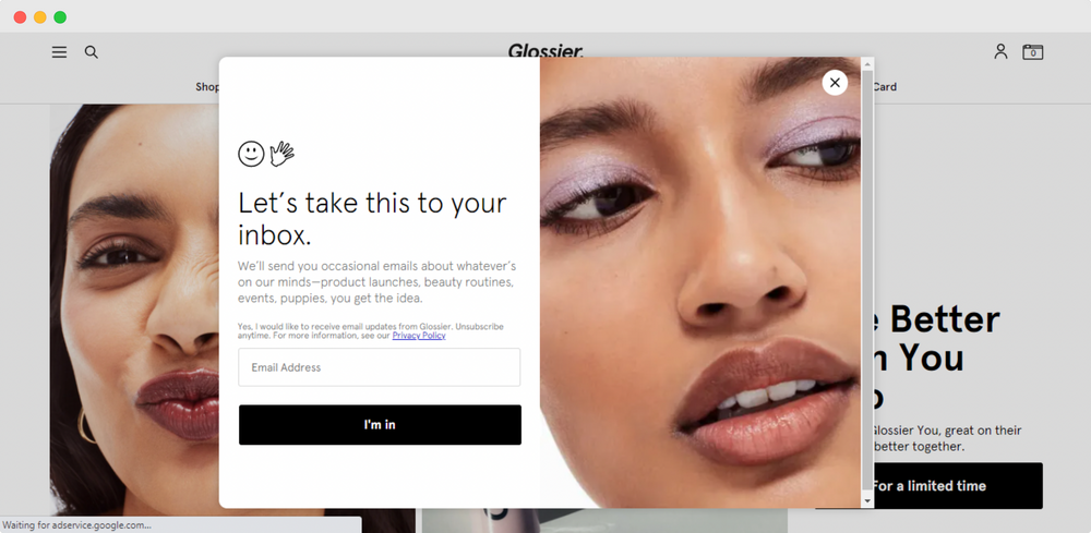 Source: glossier.com
Scroll-based pop-up
Online store offers sometimes number thousands of products - getting acquainted with all of them seems almost impossible. Studies show that the average visitor browses only 20% of the content on the site - but what about the other 80%? This is where the scroll-based pop-up comes to the rescue, a subtle way to convince the user to stay on the site a while longer. This type of pop-up displays only when the user reaches a certain point, which, depending on the specifics of the page, is between 20% and 70% of all content. As with time-based pop-ups, however, it's worth carefully analyzing the traffic on your own online store to avoid the risk of customers leaving the site too early.
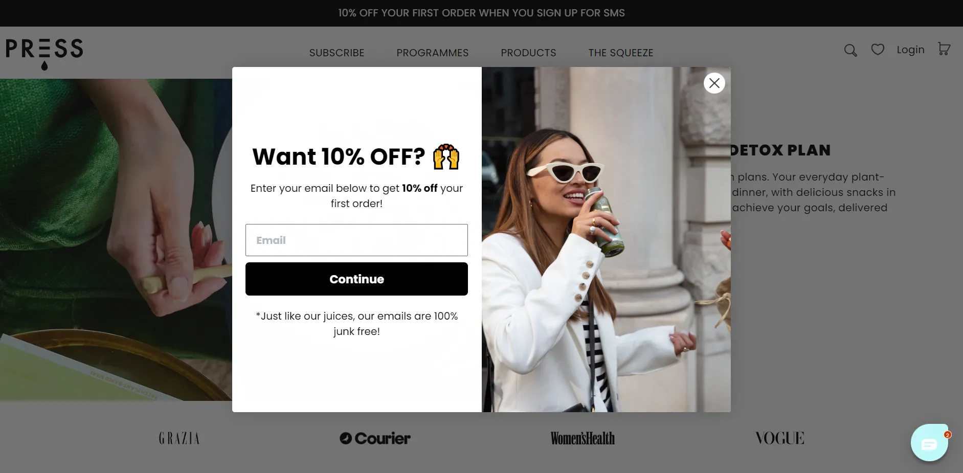 Source: press-london.com
Exit intent pop-up
You decide to abandon your shopping cart, your cursor approaches the edge of the monitor to finally close the browser, but still something stops you - a new pop-up tempting you with an attractive discount. The effect? You reconsider finalizing your order. It is the exit intent pop-up that is most often used in the battle for customer retention. What makes it so effective? Technology is responsible for it, which adapts to the actions of the individual recipient. Exit intent means nothing more than tracking mouse movements and scrolling behavior, making it possible to detect the moment when the visitor is about to leave. The above solution can "save" up to 30% of shopping carts at risk of abandonment, which significantly affects an online store's profits.
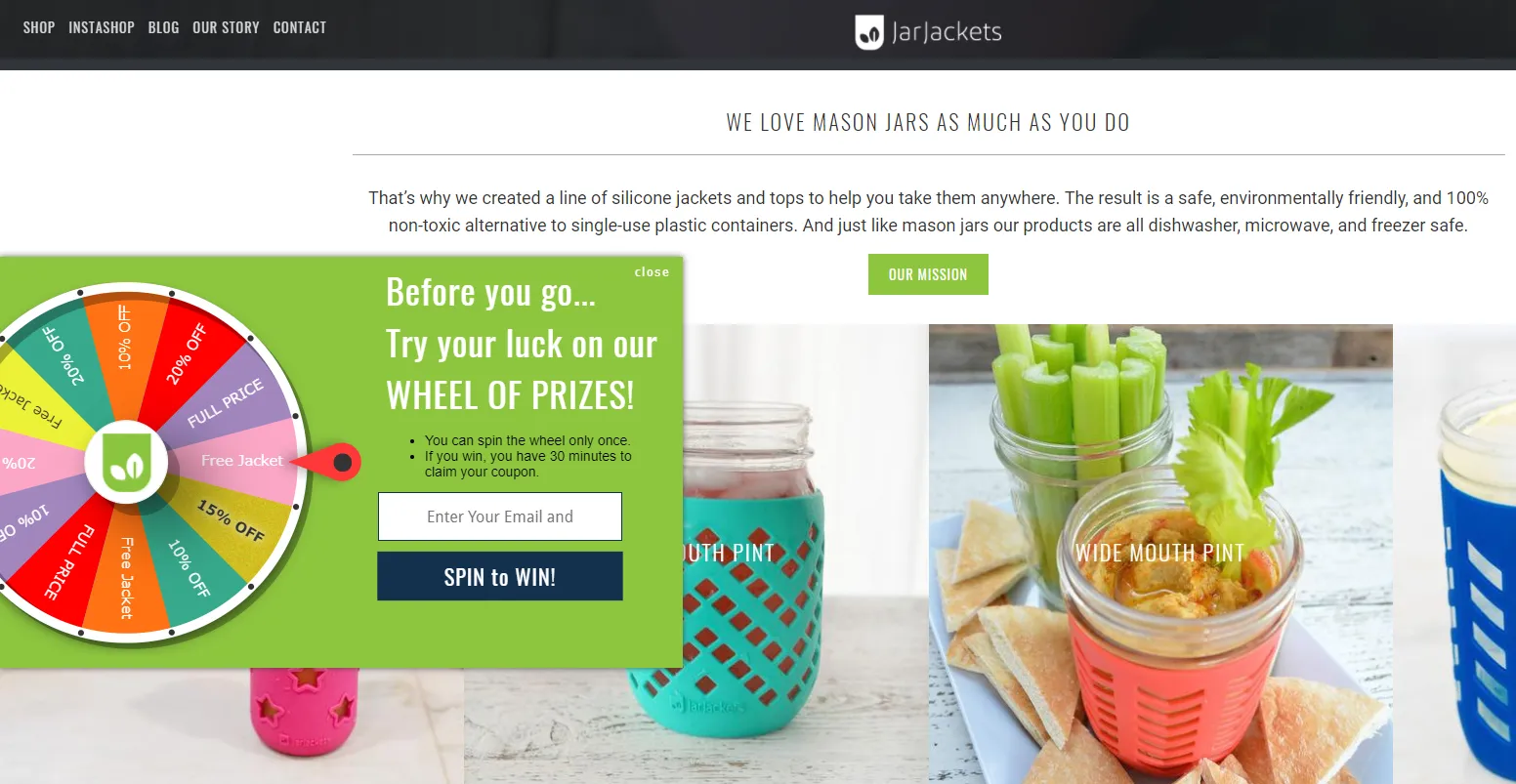 Source: jarjackets.com
A pop-up strategy for your eCommerce - is it worth it?
Enriching a website's interface with pop-ups should not be a challenge for a front-end developer - it is neither technically difficult nor costly. However, choosing the number, type and location of pop-ups can be a challenge - as these issues require taking the time to repeatedly test their effectiveness. In the table below, you'll find a summary of the most commonly raised benefits and risks, which will help you assess whether introducing this usability in your eCommerce will meet expectations.
| Benefits | Risks |
|---|---|
| Increase in conversion rate | Reaching a smaller audience than anticipated (due to some using adblock plug-ins) |
| Increase average time on site | Slowing down page loading |
| Provide necessary information, e.g., on the RODO policy | Risk of losing some customers |
| Encourage people to perform additional actions, such as filling out a form or observing social media |
Pop-up guide - how to win the game of time?
How much are you able to do in 9 seconds? While it's challenging to answer the above question, that's how long the average attention span of Internet users is. Pop-ups can prove to be a great tool to sustain the interest of your potential audience. A few practical tips posted below will certainly help you achieve satisfactory results. Which ones will you apply when planning your campaign?
Content is the king - even for pop-ups
The pop-up, like other elements on the site, is part of the brand's communication - so it's worth ensuring that the message placed in the window area matches its image. Take full advantage of the configuration options and make sure that the colors, font and style of the statement are in line with the rest of the site.
The principle of "the simpler, the better" also applies in pop-up design. The message should be written in such a way that the reader reacts to it the moment the pop-up itself appears. In other words, the call to action should be direct and understandable. The key to success may be the use of a distinctive CTA (call to action).
Not only the interior - the appearance of the window is also important
It is difficult to ignore a pop-up that covers the entire screen - such a solution, however, is too intrusive. The optimal pop-up should occupy about 15-25% of the screen. Although this significantly limits the creative possibilities, it has one indisputable advantage - it allows personalization consistent with the entire site. It is also worth ensuring that it can be easily closed. You will probably agree with the notion that nothing is as annoying as an invisible "X" icon when you decide to close a window in a hurry.
Pop-up with a mobile first approach
Nowadays, mobile devices are responsible for more than half of web traffic - responsiveness turns out to be extremely important in ensuring user experience on the website. In addition to optimizing the basic modules of the site for mobile devices, it is also worth taking care of the proper display of pop-ups. Mismatching to mobile screens can effectively discourage potential visitors.
Time in the service of pop-ups
Time on the Internet passes in seconds - displaying a pop-up at an inappropriate moment can induce a sense of confusion in the viewer and result in an instant window closure. A customer won't sign up for a newsletter if he hasn't had time to learn about the brand's offerings. He also won't be interested in downloading an industry ebook if all he cares about is completing his order quickly. He won't use a discount coupon if he doesn't plan to buy at all.
How can you avoid the above situations? Carefully analyze the purchase path of your audience (Google Analytics will probably prove useful). A pop-up encouraging a customer to read an ebook will work much better when the customer is browsing your company's blog, and he or she is more likely to sign up for your newsletter right after reading the content on your site. It should also seem clear by now that a discount coupon will only provide an incentive when the consumer has a full shopping cart.
Pop-up is a transaction
Are you creating a pop-up to encourage the recipient to sign up for your newsletter? Do you want to make sure the customer completes his order? Or do you care about getting them to complete a survey? Regardless of the goal, in each of these cases you are the one who benefits. It's also worth thinking about the form of reward for the other party, after all, we all like unexpected rewards. An extra discount code, access to exclusive content, a gift for subscribing - all of these can contribute to your pop-up bringing better results.
Pop-ups under control
Whether or not you are satisfied with the results generated by your pop-up, you need to be patient and be prepared to constantly monitor it. Analyzing the results of marketing strategies is often underestimated, and it turns out to be essential to maintain satisfactory results in the dynamically changing world of eCommerce. The best solution is to constantly test several options and work out the best model of operation.
Pop-up - support on the road to success
Do you now understand why pop-ups can benefit your eCommerce? If you've been convinced to develop a creative pop-up campaign, then don't delay any longer - time is of the essence in this case. Also, don't forget to regularly track Google Analytics and watch the results generated by your pop-ups!
It's like - are you building a strategy using pop-ups?