Spis treści:
- The importance of colour in an online store
- Colour palette in an online store - what is worth paying attention to?
- Match the colour to your brand's vision
- Keep in mind that colours matter
- Combine colours according to the colour wheel
- Maintain the contrast
- What is the universal colour for an online shop?
- What colours for your online shop?
- What colour scheme do you associate with the most popular marketplace?
- Which colours come to mind when you hear the phrase "largest parcel machine operator"?
- When you think about a refreshing drink, what product do you imagine?
- complementary shades - colours that complement each other are placed opposite of each other on the colour wheel. Combine them in this way for a more dynamic and modern effect.
- analogous shades - colours that follow one another on the colour wheel. This approach will give the page a more harmonious impression.
Colours play a crucial role in establishing brand recognition. If you have doubts about the validity of this statement, take a moment to answer the following questions. Respond spontaneously, intuitively, without unnecessary contemplation.
You probably formed associations between brands and colours such as orange and Amazon, yellow and DHL, red and CocaCola. This is not surprising, as according to the "Impact of color on marketing" study, 80% of people identify their favourite brands based on colour. This is why carefully choosing a colour palette for your business is crucial. Learn how to create a harmonious colour combination for your online store that not only attracts attention, but also helps build a loyal customer base!
The importance of colour in an online store
Colour, like a logo, font type, or advertising slogan, is an integral part of a company's visual identity. It is not just a matter of aesthetics but also a strategic tool that can influence how your brand is perceived in the market. Simply put, it not only gains visibility compared to the competition but also evokes specific emotions and reflects the brand's vision. Therefore, it is worth taking the time and attention to precisely adjust the colour scheme so that your brand not only catches the eye but also builds lasting and positive associations. How to achieve such an effect in eCommerce?
Colour palette in an online store - what is worth paying attention to?
An online store can influence the customer through a limited number of stimuli. Unlike in-store shopping, in the online environment, buyers cannot touch the product or be swayed to make a purchase by the scent filling the interior of a showroom. In practice, a customer's first impression of an e-store is mainly shaped by the sense of sight, making the choice of colour crucial. This is confirmed by the study "Impact of Color on Marketing," which states that during the first 90 seconds, in which a user forms an opinion about a product, about 62-90% of the evaluation is based on the colour alone. So, how do you choose colours to ensure they contribute to the sales process?
Match the colour to your brand's vision
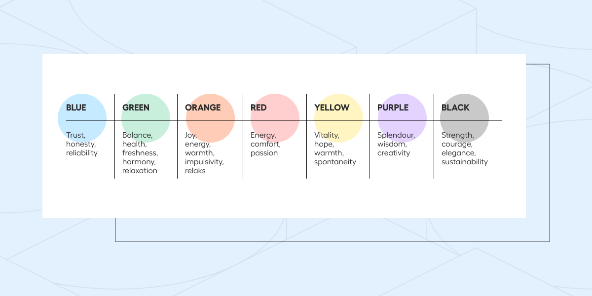
It's no coincidence that luxury brand websites often feature black, health food stores likely have various shades of green, and the tech industry tends to lean towards blues and greys. These patterns are influenced by colour psychology, which focuses on studying the impact of colours on human behaviour and emotions This is why leveraging this field of study becomes an essential tool for companies aiming to convey specific values or create positive associations among buyers. Take a look at our prepared table and find out which emotions are most commonly associated with the popular colours.
Remember, however, that you don't always have to stick strictly to accepted patterns. For example, the fact that you run a home décor shop does not necessarily mean that you have to use a soft pastel colour scheme. Sometimes, especially in competitive industries, it is worthwhile to stand out by breaking standards. A perfect example of this approach is the visual identity of one of the world's most popular coffee shop chains, Starbucks. In its early days, the company used a brown logo ( referring to the colour of coffee). As the business grew, the owners decided to move away from the safe colour scheme in favour of a dark shade of green. The result? "Starbucks green" has become one of the most recognisable shades of green in the world, inextricably associated by customers with the coffee destination.
Keep in mind that colours matter
Imagine two buttons - the first permitting approval and the second signifying resignation. Intuitively, most people will assign the first colour green, while the second one will be red. This simple example illustrates how colours have a significant impact on everyday decisions. Even the use of a colour with a less intense shade (e.g. grey) next to a more intense one can suggest that clicking on a coloured button is more important. Therefore, when designing the most important buttons in your online shop, remember to take into account that certain words or actions are assigned specific colours. In this way, you will suggest to the user to perform the expected action.
When designing specific buttons, it is a good thing to consider what emotions and actions you want to associate with them, and then adapt the colours according to these guidelines. At the same time, remember to keep the context in mind and make sure the user is aware of the consequences of using a particular colour. For example, if a button marked in red is used to cancel a transaction, make sure the user knows what will happen when they click. Additionally, to avoid confusion, be consistent in your use of colours, so that buttons with similar effects have both similar colours and content to make it easier for customers to understand.
Combine colours according to the colour wheel
Although it is difficult to say precisely how many colours exist, it can be assumed that the number of colours perceivable by humans is at least 16 million shades. This is approximately how many different tones modern monitors are capable of displaying. Choosing the right and harmonious colour combination from so many available options can be a challenge. However, the most common tool used by graphic designers in the creative process is the colour wheel.
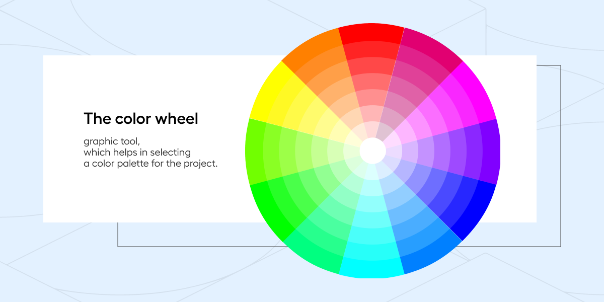
A colour wheel is a graphic representation of colours arranged in a circle, where colours are arranged in a logical way according to their relationships and mutual impact. This tool not only makes it easier to understand the relationships between colours, but also helps you to effectively match them. This allows you to consciously select colours to achieve the desired effect. Depending on your preference, you can bet on:
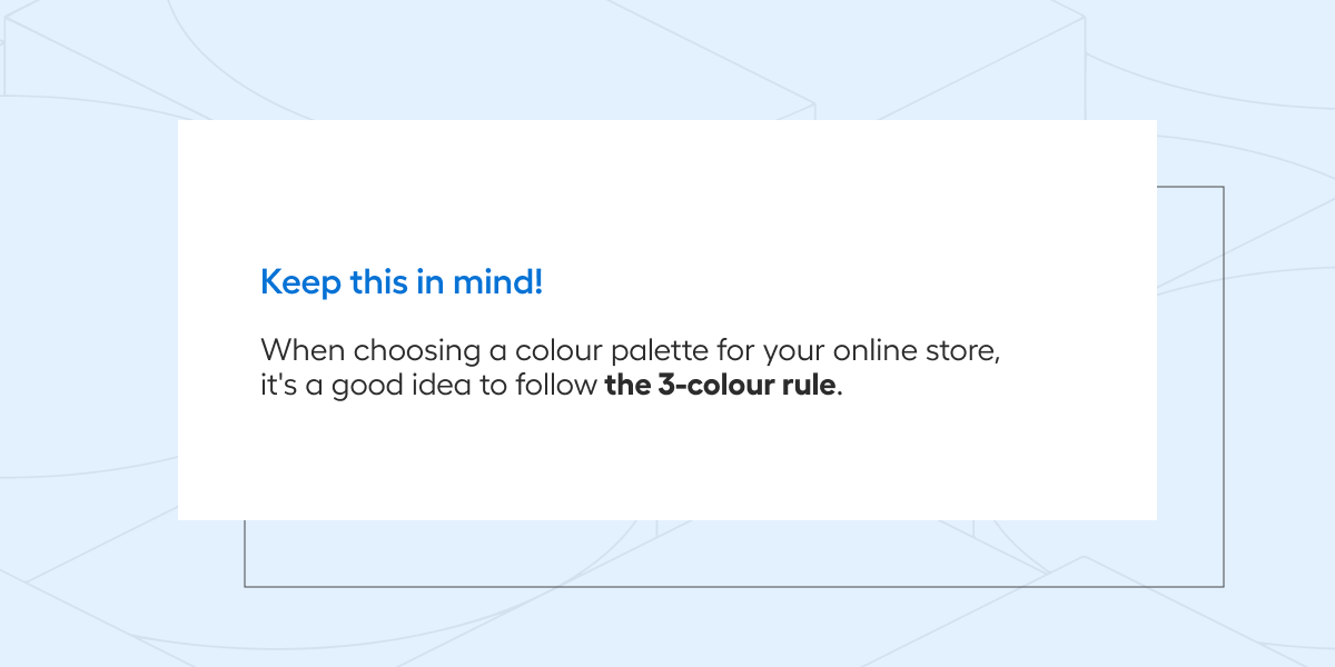
When creating an online store page, it is also worth remembering not to overwhelm the user with an excess of shades. To this end, it is worth following the "3 colours" principle, where each colour plays a separate role (dominant colour, neutral and accent colour). The dominant colour usually acts as the main background colour of the page, which gives a consistent character to the whole website. The accent colour, on the other hand, can be used to highlight important elements such as buttons or promotional signage. The neutral colour, on the other hand, helps to emphasise contrast and maintain visual balance.
Maintain the contrast
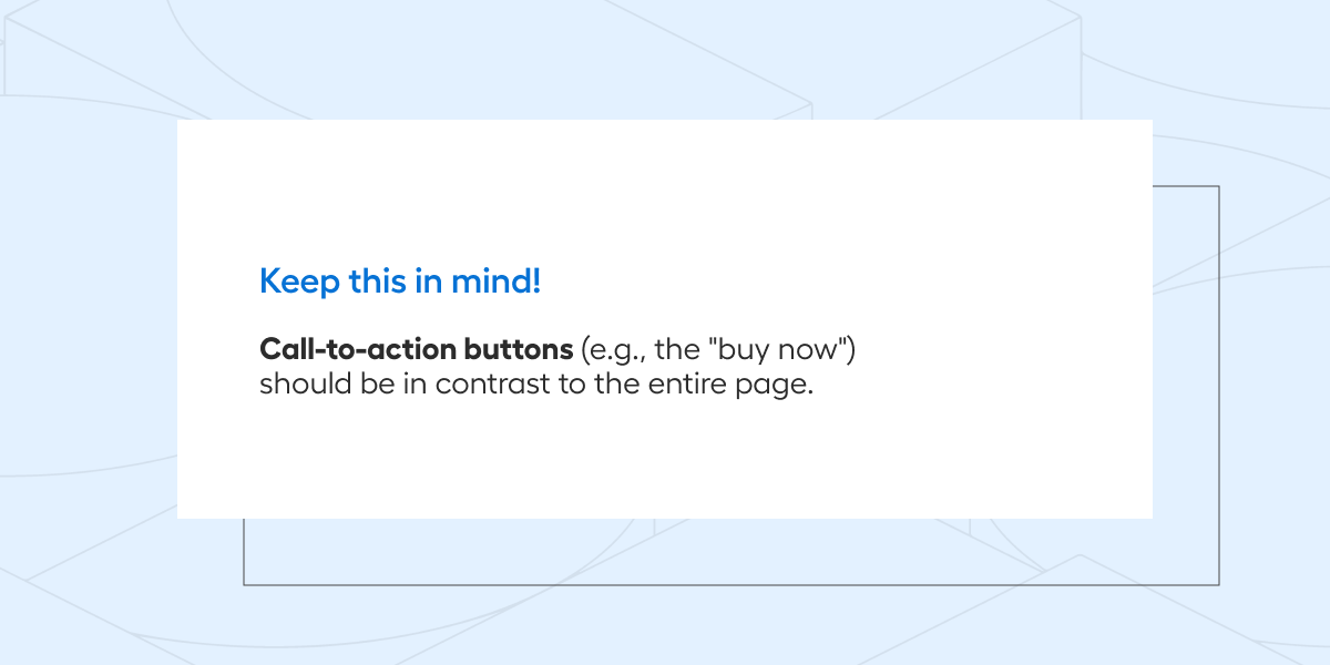
Just as important as choosing individual shades is ensuring that the colours are properly contrasted with each other. Contrast not only draws customers' attention, but also facilitates navigation, highlights important elements (e.g. call-to-action buttons) and affects the readability of content. Maintaining the right contrast is particularly important in the era of omnichannel sales, where users access sales platforms on different devices with different screen sizes.
It is also important to remember that maintaining contrast not only benefits the aesthetics of a page, but also has real significance for people with vision difficulties. According to the World Health Organisation, approximately 2.2 billion people worldwide have various types of eyesight problems. The correct choice of colours is therefore essential to enable the website to be used by all users, in line with the principles of digital accessibility. If you want to make sure that the colours of your e-store are sufficiently contrasting, it is worth using widely available tools such as contrast-ratio.com. This will ensure that users of your platform can easily read all content.
What is the universal colour for an online shop?
According to the survey, regardless of gender, age or location, the most favoured colour is... blue. Following this thought, will keeping your platform in a blue colour scheme always be a safe and profitable solution? No, because when creating an online shop, you should focus first and foremost on the preferences of your customers, and these may differ significantly from the generally accepted standards. It is therefore important to carry out market research on the expectations of your target audience.
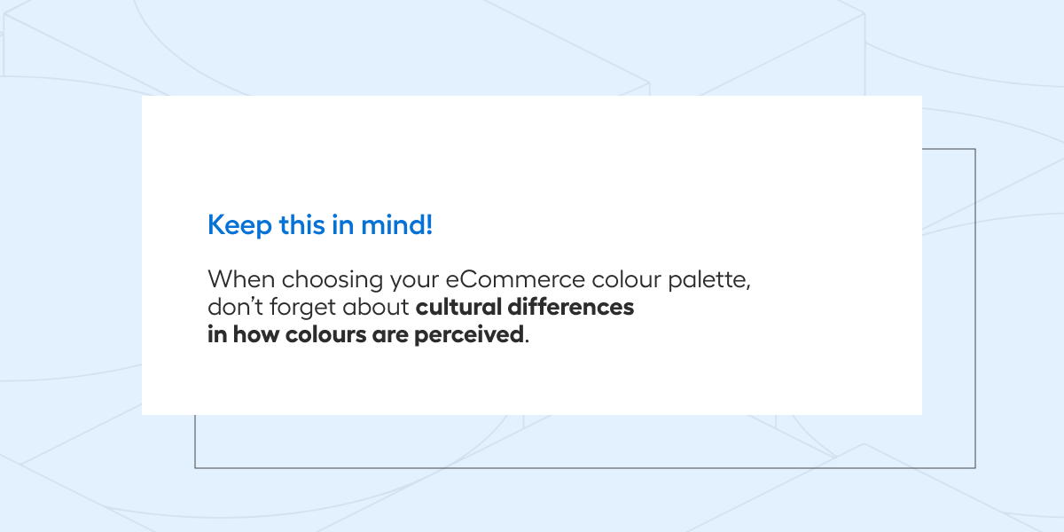
It is also worth bearing in mind that perceptions of colours vary depending on the country, history or culture (which can be particularly important when starting to sell online abroad). For example - in Western societies, the yellow colour is associated with cowardice or jealousy, while for the Japanese it is a symbol of courage. Therefore, even if a colour seems popular and acceptable at first glance, it is important to bear in mind the cultural context that may influence its interpretation.
What colours for your online shop?
When deciding on the colour scheme for your eCommerce shop, it is worth being aware that colour is not only a shade, but also a medium for the emotions and impressions that your customers will experience when browsing the platform. The colour palette in your eCommerce should, therefore, not be random. Understanding customer preferences combined with knowledge of the principles of colour selection in the online space, which you already know about by reading this article, will certainly help in its careful selection. And if you need personalised advice, we would be happy to help you design your sales platform. Write to us!