Customers buy with their eyes - how to create an effective eCommerce layout in 5 steps
A properly designed online store is not only an aesthetically attractive design, but above all a proven way to increase conversions. The arrangement of individual elements, the use of additional functionality, or the adaptation of the site's design to the screens of mobile devices directly affects the customers' decision to place an order (or abandon the shopping cart). Although designing an online store from the visual side may seem like a mere matter of aesthetics, it is in fact a complex process that requires recognition of various requirements and knowledge of the industry. If you are wondering how to bring the layout of your e-store closer to perfection, use our tips. You will find them in this article!
Online store layout - what opportunities lie ahead?
Where to start in creating an online store layout? First of all, you need to decide to what extent you want to interfere with the appearance of the platform. Based on this, you will choose the best solution - the basic options to consider include a ready-made template, a dedicated design or a refresh of the existing look (if you already have an eCommerce, of course). Each of these paths has both advantages and disadvantages. Your final choice should depend on your store's unique needs, business goals and available budget. To make your decision easier, we have prepared a summary of the most important features of each solution in the form of a table.
| ready-made template | dedicated design | refresh the current design | |
|---|---|---|---|
| flexibility | |||
| cost | |||
| deployment time | |||
| For who? | |||
5 tips that will bring your eCommerce layout closer to perfection
No matter what path you take when designing an e-commerce site, it's worth taking a few tips that will make the appearance of the platform not only memorable for users, but also translate into satisfactory profits. Why else is it worth refining the layout? In the world of e-commerce, where the level of competition continues to increase and customer expectations are evolving, a comprehensive approach to platform design is necessary. Find out what areas are worth paying special attention to.
Opt for intuitive solutions
When shopping online, customers rely on their ingrained habits. They are used to solutions they know from other online stores or even from real-life experiences (such as the layout of buttons on electronic devices). For this reason, when creating the layout of an online store, the key element is to make sure that it is intuitive in such a way that using the site does not require extra effort. According to the psychological theory of ELM (Elaboration Likelihood Model), users strive to minimize cognitive effort. Thus, when performing daily activities, they prefer easy and quick solutions. How to translate this knowledge into practice when designing an eCommerce platform?
Clear menus, an extensive search engine or the use of breadcrumbs are the basics that will give your potential customers the freedom to navigate the site. However, it is worth taking extra care with details that can sometimes be crucial for user convenience. Keep in mind, among other things:
- The size of the elements translates into their importance - headlines, CTA (Call to Action) buttons and other relevant content should be visually distinguished, clear in terms of content, but also corresponding with other elements on the page (their size should not cause a sense of overwhelm). The customer should always easily understand what is key on the page and what actions are expected of him.
- Excessive content can discourage the customer - if you have a lot of information to provide (e.g., as part of a product description) or your offer covers a wide range of products, think about presenting them in a clear way. You can do this by using listing or filtering, so the customer can quickly find what interests him or her.
- It's a good idea to use natural language - phrases familiar from everyday life will make navigating the site more accessible to the viewer. An example would be replacing the standard "go to checkout" with the phrase "I buy" or "I pay." Such a subtle change can make interactions on the site more intuitive and enjoyable for customers.
Remember that intuitiveness is the key to keeping customers' attention and getting them to make a purchase. If the solutions on your online store's website require extra effort and understanding, there's a good chance that the shopper will abandon their shopping cart and move to a more accessible competitor's site. Use your knowledge of online shopping habits and customer preferences to create a site that offers an easy, fast and enjoyable shopping experience.
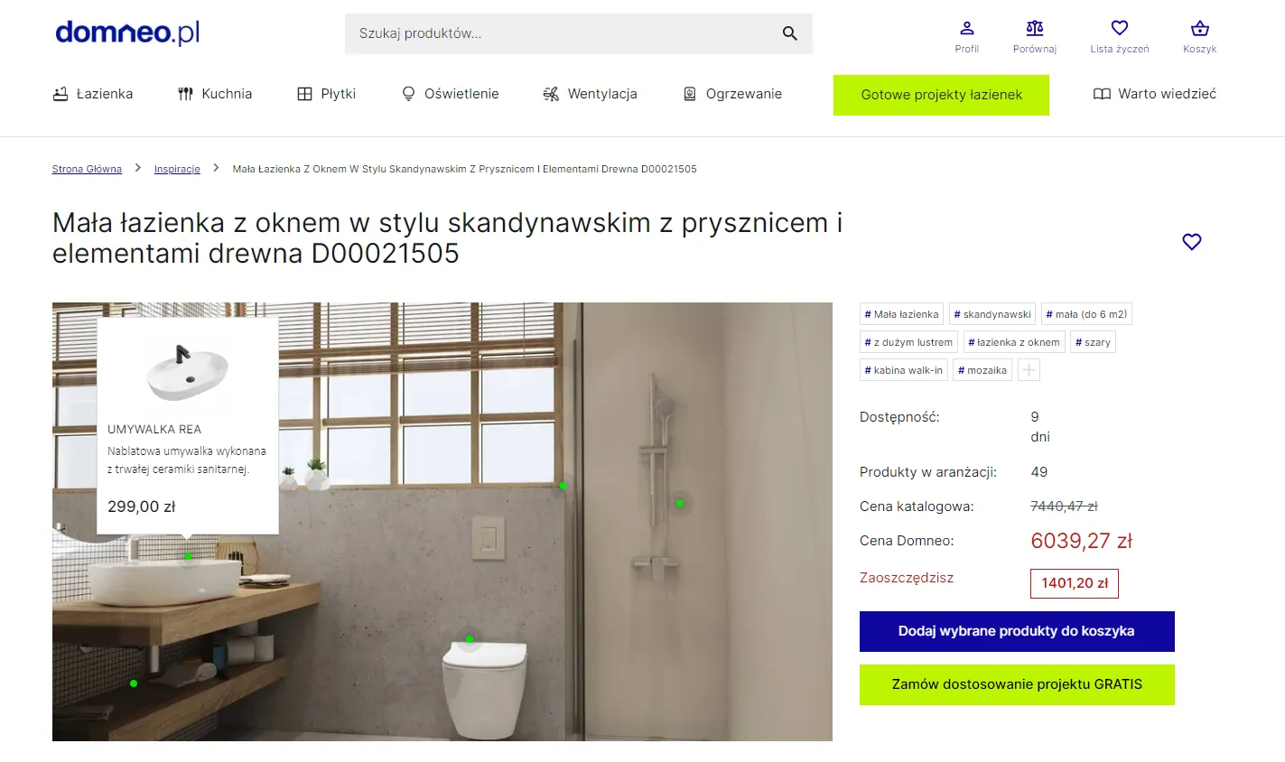
Enhance your product card with rich content
In a reality where the user's attention is distracted from many sides, it is important that the design of the site encourages the user to perform the expected action (such as buying a product). According to an Adobe study, more than 60% of shoppers expect the content on a store's website to capture their attention. To achieve this goal, it can be helpful to design the layout of the sales platform in such a way that it takes into account the possibility of adding so-called rich content on the product card. What is the phenomenon of rich content?
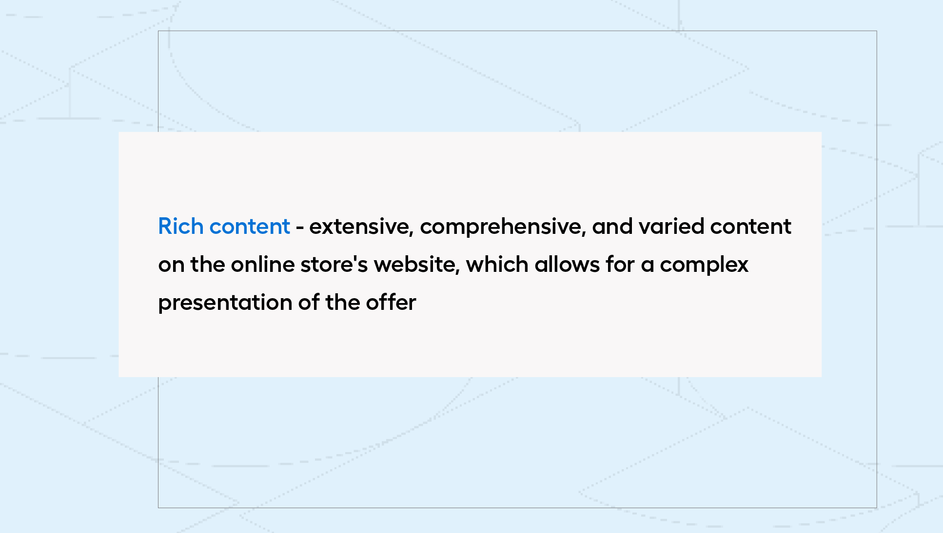
The use of rich content makes it possible to create interesting and engaging product cards. They include not only standard photos and descriptions, but also interactive elements and precise technical specifications. These can include:
- video content,
- 3D visualizations (e.g., using VR and AR technologies),
- infographics,
- downloadable PDF files.
The multidimensional presentation of products provides a complete picture of the offer. Thanks to this, a customer interested in a purchase will not be forced to leave the shopping site to look for additional information. What's more, rich content encourages interaction with the site (especially with VR-type solutions), which makes it possible to take a close look at the details, view the product from different angles or personalize them to one's needs in real time. Carefully prepared rich content demonstrates professionalism, commitment and concern for the customer, which translates into a positive shopping experience and building customer loyalty, which is particularly important for maintaining long-term relationships.
Make sure your layout is responsive
At a time when customers are accessing online stores on a variety of devices, it is important to focus on responsiveness issues. According to Gemius' 2022 report, up to 75% of users choose the smartphone as their main shopping tool. That's why it's crucial that your layout works flawlessly on smaller screens and adapts to their different resolutions. To this end, it is worth using your UX (user experience) knowledge and considering which elements are really important and which can be dispensed with. It is often necessary to reduce unnecessary graphics or content in order to improve the clarity and loading speed of the site. What elements are worth, then, paying special attention to? These include:
- distance and size of buttons - in the mobile version, clickable elements are usually larger to facilitate touch access and avoid unwanted clicking.
- form layout - in the mobile version, forms tend to be shorter and more optimized to facilitate data entry on a small screen.
- integrations with device features - mobile versions can take advantage of device features such as the camera or microphone to provide a more interactive experience (e.g., virtual fitting room, voice search).
A solution conducive to the idea of "mobile first" is also PWA technology, through which you can map the experience specific to the use of mobile applications. In addition, in this way you will also take care of other important issues from the perspective of the eCommerce owner, such as increasing the effectiveness of SEO efforts.
Surprise by keeping the balance
When a customer enters an e-commerce site, he expects an element of surprise that will make him remember your brand for longer. At the same time, he also cares about a quick and intuitive shopping experience. When introducing additional functionality within the eCommerce layout, you must keep in mind that the task of the platform is first and foremost to sell. Too many colors, pop-up banners or complicated graphic elements can effectively discourage users from placing an order and make it difficult for them to navigate the site. An interesting design will prove useless if the platform does not meet basic guidelines. How, then, to effectively combine aesthetic design with practical eCommerce?
The key is to find a balance between introducing interesting functionalities and ensuring a smooth shopping process. The unique elements on your site should first and foremost be in line with your brand and the industry you operate in. If you offer highly complex or personalized products, customers will appreciate tools such as automatic configurators or shopping calculators. On the other hand, if your offer is less technically complex, authorial illustrations, graphics or high-quality photos that correspond to your brand will work well.
Create a platform that's accessible to everyone
Nowadays, online stores are used by almost everyone - this statement is not at all an abuse. The growing eCommerce audience is not only an opportunity but also a challenge to meet not only their needs but also their individual capabilities. How to make eCommerce accessible to all?
The answer to this question is the concept of accessibility, behind which are the principles of eCommerce store design that prevent the exclusion of users due to various limitations (such as disabilities, cognitive impairments, or any temporary restrictions). According to the Central Statistical Office, there may be as many as 7 million people in Poland subject to digital exclusion due to disability. To reduce the level of exclusion, it's worth reading the WCAGC (Web Content Accessibility Guidelines) - they are a set of accessibility guidelines. Their idea is based on 4 pillars, namely:
- Perceptibility - allowing all content to be received by hearing or sight,
- functionality - guaranteeing the ability to use all features of the platform,
- intelligibility - enabling the adjustment of contrast, font size, or playback of voice transcription,
- compatibility - facilitating the cooperation of the website with other programs or devices supporting people with disabilities.
Creating universal eCommerce platforms in the spirit of universal accessibility is an important step in building an inclusive and barrier-free online environment. For this reason, ensuring full accessibility online is one of the areas of the EU's strategy to support the rights of persons with disabilities (Strategy for the rights of persons with disabilities 2021-2030).
Why does appearance matter, or what should your online store look like?
From intuitiveness to accessibility for all users, success in designing a satisfactory e Commerce layout consists of many elements. Therefore, in order to build a lasting image of your platform in the market, a comprehensive approach that takes into account both the reliable performance of each of its elements and guarantees an exceptional user experience is essential. If you are still lacking inspiration for your eCommerce layout, remember to keep up to date with your industry - you can find interesting ideas on portals such as Dribble or Behance. In order to detect possible mistakes, you can also commission a UX audit, which will show you what to pay attention to. Don't know where to start? We will be happy to help!