The splendour vs minimalism in online store - exploring global differences in eCommerce Design
Tabel of contents
- Why do online stores look different around the world?
- Not just culture - what else influences different approaches to design?
- What distinguishes high-context design?
- What distinguishes low-context design?
- Globalisation and differences in design
- See eCommerce through your customers’ eyes
You visit an online store’s website. You're bombarded from all sides by colorful product offers, pop-up windows, and an overload of content. You might think: "This store probably isn't selling anything," or even, "This site looks suspicious." But in reality, it's quite the opposite. Online stores designed with such opulence are hugely successful—but among a completely different group of customers.
This type of design is favored by users from "high-context" cultures (e.g., in Asia), where the richness of information and bold design is key to effective communication and an engaging shopping experience. You, however, are likely accustomed to platforms tailored to “low-context” communities, which expect minimalism, simple interfaces, and clear messages. Want to learn more about the differences in design for both? In this article, we’ll explore how cultural nuances shape the look and functionality of online stores worldwide.
Why do online stores look different around the world?
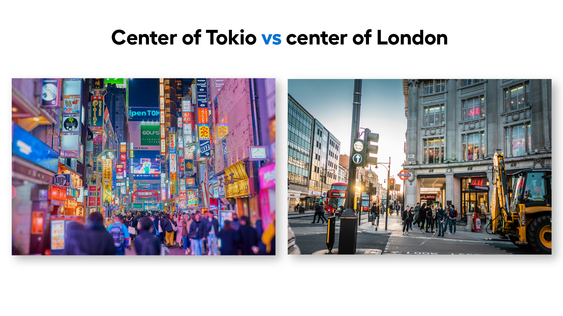
We view the world through the lens of our own civilization. So, to understand the differences in web design, we must take a closer look at how we communicate, how we work, and even the kind of spaces we live in. Let’s take London and Tokyo as examples—both are capitals of developed countries, where daily life seems similar at first glance. But if we look at how their spaces are designed, we can already see some differences. In central Tokyo, colourful, content-rich ads and neon signs dominate, whereas London opts for a more minimalist, toned-down approach, with fewer messages (e.g., brief calls to action like “buy now” or “check out promotions”).
This contrasting approach to urban space helps us better understand why Asian online stores are often filled with information and visual richness, while Western websites tend to lean towards minimalism. These differences are deeply rooted in the concepts of "high-context" and "low-context" cultures, which explore how different societies convey and receive information.
In "high-context" cultures, which include many Asian countries (e.g., Japan, China, India), communication extends far beyond verbal messages—it relies on subtlety and multiple layers of meaning. What we want to convey is not just in the words, but also in surrounding elements like body language, tone of voice, and other contextual factors.
Meanwhile, in "low-context" cultures, dominant in America and most European countries, communication is more direct and literal, reflected in simplicity and clarity. In short, what is spoken is equivalent to the speaker's intentions and will.
Understanding these differences helps explain why global brands may present vastly different designs for their websites in various parts of the world. A prime example is comparing the design of McDonald's websites in Japan and the UK—one of the most recognizable brands globally.
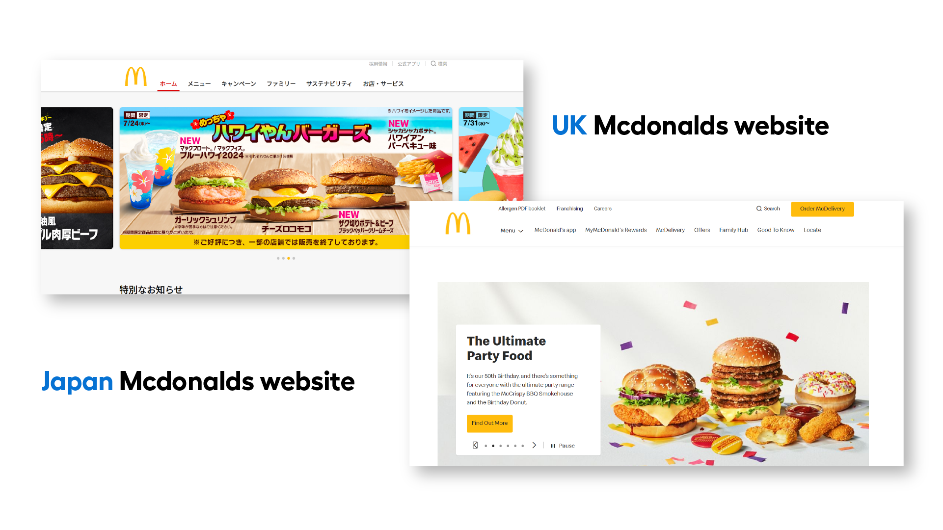 Source: UK Mcdonalds website vs Japan Mcdonalds website
Not just culture - what else influences different approaches to design?
Not only culture influences the different approaches to designing online stores - technological development, which has progressed at different speeds in various parts of the world, is equally important. In America and Europe, digitization began around the 1970s, allowing for the gradual improvement of devices—from desktop computers to smartphones. In Asia, however, this development was much more dynamic, with many countries experiencing rapid technological leaps. For example, in China, many people started their journey with technology via a smartphone rather than a computer. This has made China the largest mobile device market in the world, with over 1.6 billion smartphone users.
It’s no surprise, then, that for many Asians, the standard is not a website but a mobile app. Moreover, these apps are not simplified versions of websites; on the contrary, they often serve many functions at once and are filled with information (the so-called "super apps"). Platforms like Alipay and WeChat are examples, offering a wide range of services, from bill payments and banking management to booking taxis and shopping.
Users in Asia are accustomed to using such multifunctional apps, which they consider intuitive. This contrasts with "low-context" cultures, where intuitiveness means simplicity and clarity.
What distinguishes high-context design?
An abundance of information, vivid colours, and multifunctionality—these are just a few characteristics of design tailored to users from "high-context" cultures. But what else sets this design style apart? Let’s take a look at the marketplace Temu, one of the fastest-growing Chinese sales platforms.
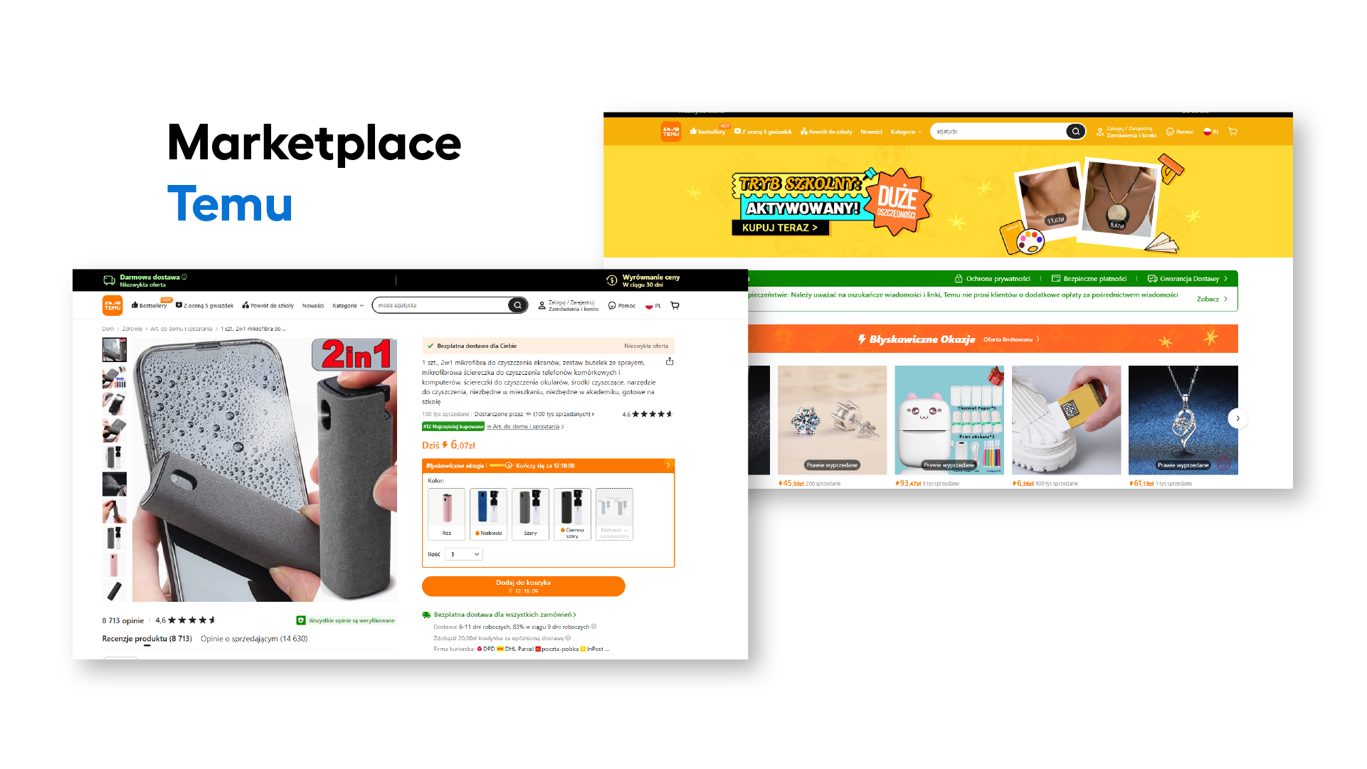 Source: Marketplace Temu
In what might seem like chaotic design to a European user, lies exactly what Asian users expect. For them, an online store is not just a tool for placing an order, but a form of entertainment. Browsing a site full of hidden features and information is a way to spend free time. This phenomenon is known as "shoppertainment" (shopping + entertainment). Key features that capture buyers' attention include:
- Vivid aesthetics – bright colours, animated elements, and an overload of information are designed to grab attention and constantly stimulate the user's senses.
- Interactivity – pop-up windows, lotteries, spin-the-wheel games - these are just a few elements that encourage active engagement while browsing the site.
- Rich content - detailed product descriptions, numerous photos, videos, and even live streams aim to provide a comprehensive view of the offerings.
- Gamification - game elements, such as collecting points or advancing through loyalty program levels, make shopping even more engaging.
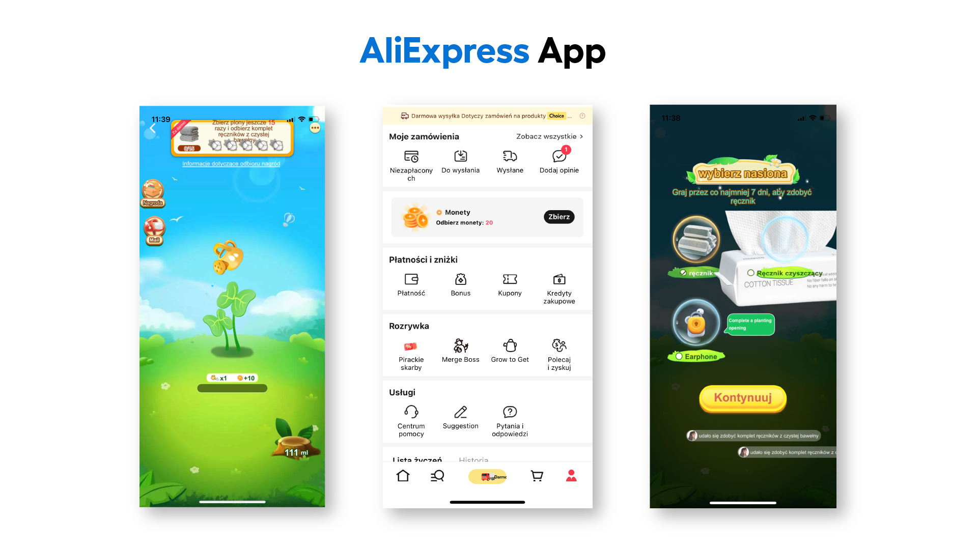 Source: AliExpress app
What distinguishes low-context design?
In contrast to high-context designs, Western online stores often prioritize minimalism, which is associated with professionalism in those cultures. Simple, clear layouts with images and minimal text, complemented by ample white space, create a user-friendly and intuitive environment. The use of straightforward fonts further enhances clear communication, directing users’ attention to key elements.
This can be seen clearly with the example of Amazon in the U.S., which employs a specific design approach. Over the years, Amazon’s marketplace design has not changed drastically in terms of style. Every modification aims to improve usability, not aesthetics, maintaining a consistent interface that customers have become accustomed to over time. Amazon introduces only small changes to user experience (e.g., navigation, menus, filters), each of which is backed by data analysis and user testing.
In summary, the basic features of low-context design include:
- clear information structure – hierarchical organisation of content and easy navigation.
- minimalist design – reducing visual elements to the necessary minimum.
- user-centred focus – all design decisions are made with the goal of providing the best user experience.
- search prioritisation – intuitive search, advanced filters, and clear results.
- consistency - maintaining a consistent visual style across the platform.
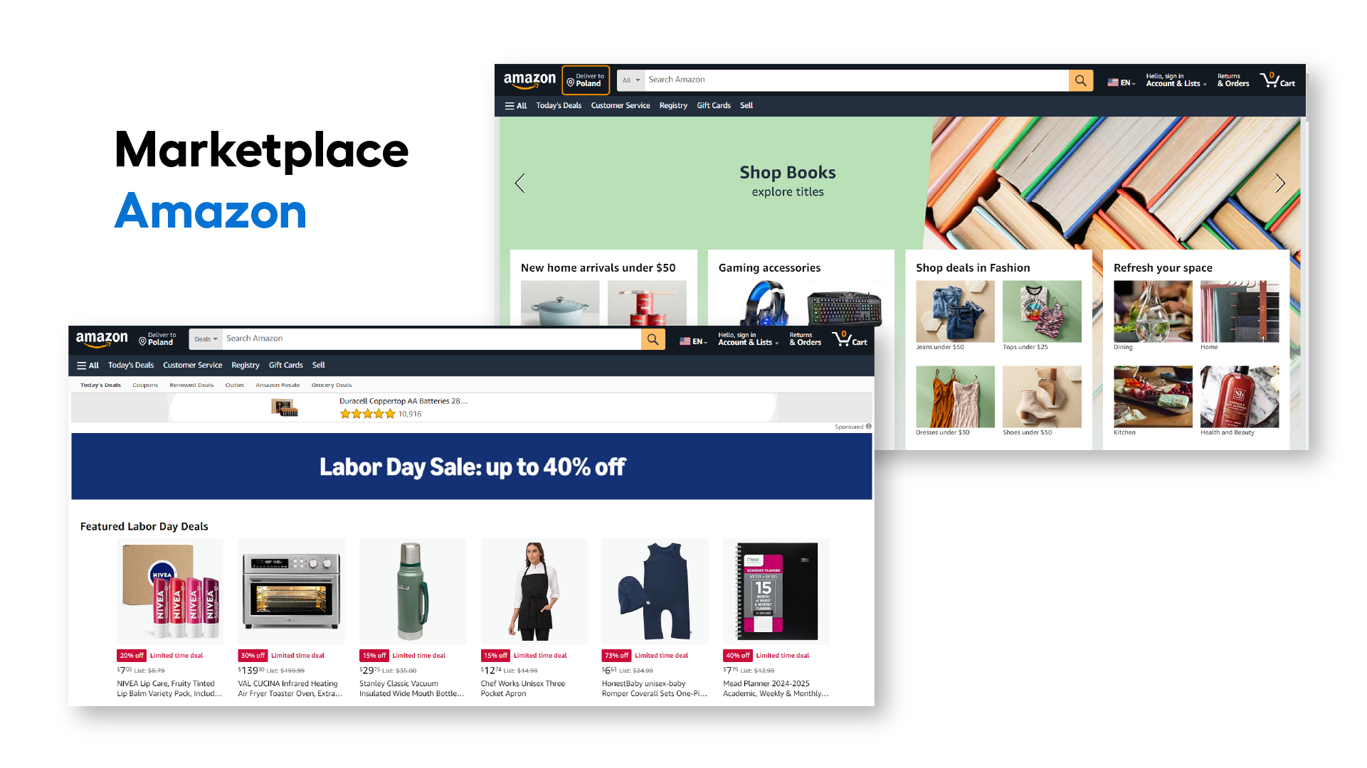 Source: Amazon
Globalisation and differences in design
It’s important to remember that the division between high- and low-context design is not absolute, and the boundaries between these approaches are becoming increasingly fluid. First, the styles often overlap depending on the industry in which an online store operates. For example, fashion or hobby stores, even in Western markets, may adopt more complex and interactive features (e.g., virtual fitting rooms) to stand out from the competition.
A key factor driving the blending of design styles is globalisation. Thanks to this, platforms like the Chinese Temu or Shein have gained worldwide popularity. Increased advertising, influencer recommendations, competitive prices, and easy access to their apps have led to a greater acceptance of differently designed stores in Western cultures.
Brands with global recognition, such as Apple, can also afford to maintain the same style across platforms. Thanks to its established reputation, Apple doesn't need to adapt its interfaces for different markets. The company successfully maintains a consistent design that resonates with a broad audience worldwide. Apple’s global identity allows it to preserve a unified design regardless of local cultural differences, highlighting the strength of its brand and unique approach to design.
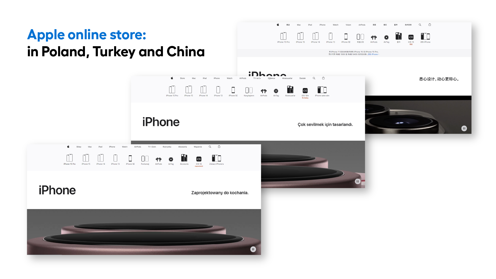 Source: Apple
See eCommerce through your customers’ eyes
Cultural context plays a key role in designing online stores, especially when planning to expand into foreign markets. Simply copying a design from one market to another rarely yields the desired results, as each region has its own unique expectations and preferences. For example, minimalist design that works well in "low-context" cultures like Europe may be seen as too simple or even incomplete in "high-context" cultures like Japan, where users expect rich content and interaction. In short, success in the global eCommerce market depends on the ability to tailor design to the specific needs of each culture. Only by doing so can you build a strong brand and gain loyal customers worldwide.